
Miniature Monday – Were Rat
A hulking monstrosity comes bursting out of some sewers, or from under heaps of garbage, maybe? Read on to see what terrors our painters envisioned this week (hint: There are loads of them!)
(posting by Antonia)
Hi everyone! I hope you are still okay, dear readers!
I’m sick*, our little one is sick (since toddlers are perfect human incubators, both cases might be connected…!) and still, we are only one day late with the article! I’ll count this as a win.
*Not that kind of sick, fortunately, but it seems there are enough other respiratory viral infections out to get me *sigh*
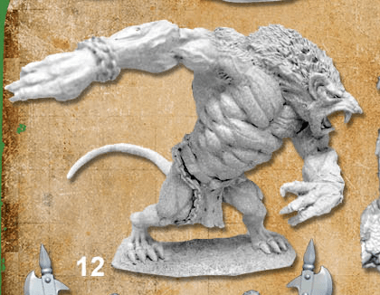
Anyway, the Were Rat/Rat Ogre miniature is pretty cool, with lots (and lots!) of muscles and an overall convincing anatomy (although the pose seems a bit weird to me, maybe it bends over a bit too dramatically?). The large skin/fur areas allow for drybrushing and wet blending which can help to achieve a realistic look (and get even a large monster done in no time, as a bonus).
I painted my rat as an albino:
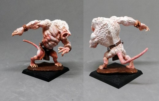
I don’t know why, but I like painting albino versions of monsters and critters – maybe because it allows for a more translucent style and somehow looks like an “inverted” color scheme, which is always interesting from an artistic perspective. But I guess it might also be for dramatic effect, because the light colors make any critter look more interesting and eerie.
To achieve the effect I used mostly white and a “light skin” tone and added brown and red washes when I found that the whole model didn’t look pinkish enough. (The pic seems to be a bit overexposed now that I look at it, maybe I can re-shoot it one day)
Dirk’s Rat Ogre is a real beast:
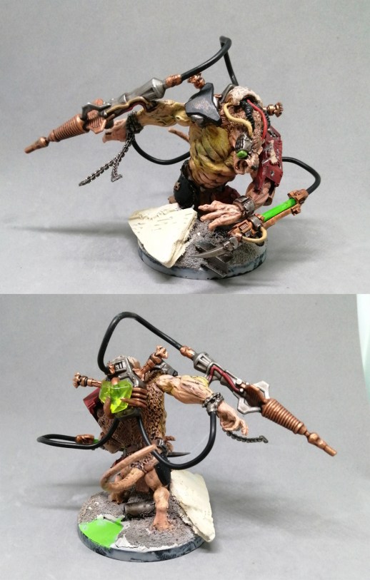
He will use the mini in a tabletop army of sci-fi rat people and heavily converted it by adding various pieces of sci-fi weapons, armours and tech. He even included a plastic gemstone as energy crystal/warp stone!
I guess we’ll need some time to see all the details – the Ogre is still a WIP but already super impressive! As you know I love genre-bending (as seen with the sci-fi skeleton or the cyber minotaur) and this is a prime example!
Timothy used earthy colors:
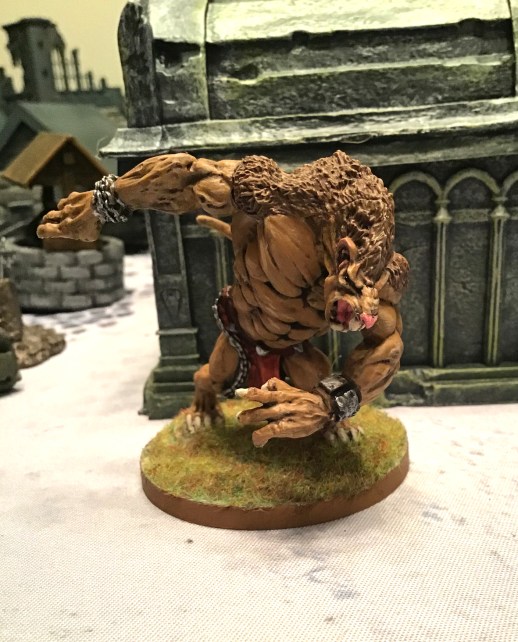
I like the strong colors and highlights, the shadows are dark but still work well to emphasize the heavy muscles! The red of the loincloth is a good choice for a spot color.
Michael sent a whole swarm this time!

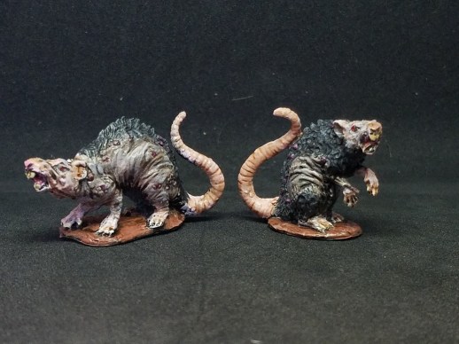
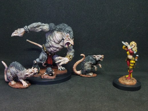
He wrote “I’m sending in a few pictures this time. We have the Ogre Wererat – there are subtle connections to my piper, as his loincloth is red (darker though), and I used the yellowish Tanned Leather color for his bracer and belt. I’m really happy with how his skin turned out, especially the transition from gray to pink. As you can see, I took the opportunity to paint several other rats as well. I put three small rats (from the first Kickstarter!) on his base, and also painted two larger, kind of diseased-looking dire rats (from KS2, I think), all with the same colors. Finally, I have my group shot of the piper leading the rats… whether it is away from a village or towards one, who knows?!”
A really cool posse or warband you made here! Just by looking at them I get ideas on how to use them in a RPG scenario! And I love the grey-pink skintone. Perfect choice!
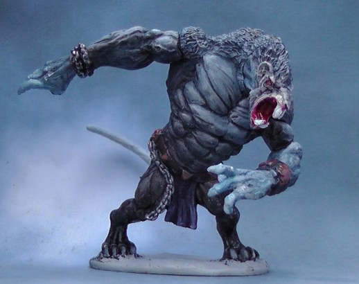
Jim’s rat is half beast, half man(ish):
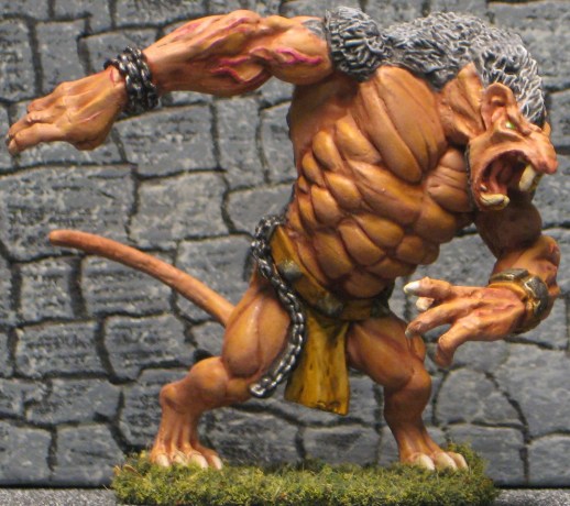
He said: “When I saw this mini on the schedule, I have to admit I groaned a little. I am not fond of skaven, ratlings or rat-men and (by way of extension) Rat Ogres. They have never seemed like threatening or scary opponents to me and are a bit too GW for my taste. Obviously every low level adventurer has to meet his or her fair helping of giant rats, but that’s a different story. However, once I got going on this big guy, I really enjoyed it and found the detail to be quite good. I debated whether to go more rat or ogre or human on the skin but finally went with basically a human skin tone overall. Now I’m very pleased with how he came out and actually glad to paint a mini that I might have skipped otherwise! I missed a couple of things but otherwise he’s finished.”
I like the contrast between the grey fur and the skin, and the pink veins really pop (not literally, I hope). Did you intentionally mirror the loin cloth color in some areas of the torso, or is this just an optical illusion?
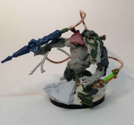
Arjen’s creature is a true experiment:
He wrote: “I think this large critter is supposed to be a not-warhammer skaven rat ogre, as I do not know of any D&D rat ogre like this. Anyway, as I probably will not use it in tabletop, I used it to do some more experimenting. I tried to get a bit of zenithal lighting on this mini (like last week), but using a virtual blue light source instead of white. I did not go all the way with this, as I did not make a shadow under its head. Still, I think it worked out well. The lower body is grey brown; to make the mini more interesting I did not only use mixes of blue and grey on the upper torso, but mixed in some purple here and there. I also experimented on the bronze studs and bracelet: I used a metal-bronze paint first and then made it less shiny by applying layers of diluted brown paint (before, I mixed the brown with the metal paint before applying it). I think I like this new technique better as you can assess the effect on the mini instead of guessing in advance what it will look like.”
Thanks again for the insights into your painting process – the lighting effect works well and gives the impression of a book illustration. Adding purple to blue is a nice touch too, because it reflects the variation in natural colors that we often forget while painting with pre-mixed color bottles. I really like this organic workflow approach!
This week’s gallery:


Coming next:
04/13/20 Bones IV Add-Ons: Underdark – Fungoids! Pick as many mushroom people as you like, I added a pic from the graphic, it seems they are not yet on the reapermini page.

Update: Here is the Fungal Guardian and the Fungal Bruiser on the reaper page
Here is the link to Reaper’s graphic with all the core pieces, but it’s one and veeeery long picture so be prepared for some scrolling. On the other hand it has separate numbers for most of the pieces. I will add individual shop links as soon as they appear!
Here is the underdark Add-on.
04/27/20 Bones IV Elf with whip (No. 154 on the KS pic)
05/11/20 Bones III Fomorian giant
05/25/20 Bones IV Ettin (No. 99 on the KS pic)
06/08/20 Bones IV Baba Yaga (No. 96 on KS pic)
06/22/20 Bones IV Add-Ons: Underdark Gloom Stalker (No. 540 on the Add-on graphic)

My thoughts on this week’s contributions:
I really like Antonia’s albino rat. It is like someone did an evil experiment on a white labrat and now it is a raging monster. There is a sort of lighting effect there as well as there are more dark parts below and more light parts on the upper parts of the mini. I think that if this was my mini, I would not have resisted the urge to do a light brown wash on the mini, to bring out the fur texture, but it would have probably spoiled the bright white look of the fur, so good call that you did not do that (or you did very little, I cannot tell from the picture).
Dirk: I especially like what you did with the head. Tubes sticking out, the artificial eye… I also like that you added some more chain to its wrist. Some parts, like the black tubes look a bit too smooth and clean, maybe adding grease spots with a bit of wash would be an idea?
Mike: great overall look. The small rats on the base help to emphasize how big this critter is. You did something interesting with a greenish/brownish paint to break the monotonous grey. Is it the lower layer, or did you add it later?
Jim: very neat highlight on the fur. Nice bright green eye. I wonder if making the eye socket darker would have made it look even brighter (it is a trick I use now and then).
Timothy: A playable mini that looks pretty good on the tabletop. If it is your intention to make a playable mini in an efficient way, read no further. However, if you want to improve something here are my comments:
I think you rely too much on washes. Washes are very good for bringing out very fine details or filling deep recesses that are difficult to reach with your brush. Also, washes are good if you want a slick, oily look. For the torso, painting the recesses with a dark paint and then painting the rest with a lighter paint, holding it flat near the more subtle recesses, so it will not fill them with paint, is IMHO the best way. Look at Mike’s mini for a good example. If you do use washes, do not just blotch it up there and let it do its thing, but watch what it is doing and if it pools too much anywhere, suck some wash away with a clean dry brush or a paper towel.
That’s a good idea for the eye socket. I hadn’t even thought of that on this guy!
I just want to be clear that my work was a combination of layering and washes. I almost always coat my entire model in a dark brown (Reaper’s Walnut Brown) before I get started, making sure especially that it gets into all the deep recesses. For the skin on this model, I used Reaper’s Wolf Gray on the gray parts and a combo of Wolf Gray and Army Painter’s Centaur Skin for the pink color on the chest, face, hands, and feet. I washed all the gray parts with Nuln Oil and the pink parts with Army Painter Flesh Wash. I highlighted the gray with just the base Wolf Gray again, and then a slightly whitened version, whereas I just used Centaur Skin to highlight the pink parts (and I think one more layer of tippy-top highlights with a mix of Centaur Skin and a teeny bit of Yellowed Bone). However, to get the overall look to blend better, I did go back to the Nuln Oil, spreading it carefully (emphasis here!) over the pinker areas, and lining it into the deep parts of his chest. That last bit really made the muscles stand out.
Arjen’s advice about drawing off excess is spot-on, though. Sometimes you do want huge dark contrasts and can really glob the wash on. I think the style of adding a lot of heavy shadows – like Timothy’s model – can give a kind of comic book aesthetic (I was reminded of a pulp horror comic when I saw it). Sometimes, though, by drawing off the excess, you can get a subtler look and stronger detail.
Antonia – the lab rat run amok! I got a chuckle thinking this might be the fate of Pinky and The Brain (probably Pinky). Looks great! There’s a lot of red on his side, which makes me think his mutated state is straining his body, and he might be tearing apart.
Dirk’s looks crazy! That’s an awesome aesthetic. I haven’t fallen down the rabbit hole of 40K, but I love the idea of cyber-monstrosities. Really nifty mod work.
As I mentioned above, when I saw Timothy’s, I was reminded of a pulp horror comic due to the dark shadows. Very classic look. I like the face a lot; the nose has a lot of contrast, and I think it makes him look very distinct.
Jim succeeded in making his look more like a man who has changed. I think I can actually visualize a bit of what this individual looked like as a human. Nice eye, too.
Arjen – excellent work on the zenithal lighting bit. The darker overall color scheme and blue lighting reminded me of the night creatures in the Castlevania series on Netflix. I see this individual as being very supernatural.
I’d throw a rat joke in here, but I don’t want everyone to hate me!
Antonia – I love the albino! It reminds me of a lab rat. Maybe an experiment gone horribly wrong.
Dirk – Great conversion! And the base came out very well, too.
Timothy – Yours makes me think “monster”. Very bestial with not too much ogre/human. Sort of a distant cousin to my scheme.
Michael – Definitely a rat, albeit a huge, mutant one! The pink is really subtle and look very realistic, if that’s the correct term. The whole group looks great together and very unified.
Arjen – Wow! Really nice color choices as well as excellent techniques. A successful experiment for sure. Yours feels very “underdark” to me and is strikingly scary!
I seem to recall that GW ogres are essentially huge humans so that’s where my skin color came from. The fur is an exercise in maximum contrast as the deepest shadows are black and the highest highlights are white. I wouldn’t want to use that technique all the time, but it makes for a very dramatic effect! I overdid the veins a bit but my first pass was virtually invisible. Also, I think the metal parts could use a little rust. Good eye, Antonia! The highlights on the skin are distinctly yellowish brown but smoothed out a bit with a wash. Truthfully, it was inadvertent. Still, I’m happy with this guy looking like he just burst out of captivity.