
Miniature Monday – Fomorian Giant
Distorted and ugly. Is the fomorian giant a hideous mystical creature, or just some “poor” mutant out to rob and maim? Let’s have a look…
(posting by Antonia)
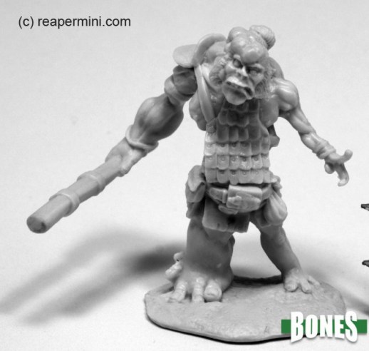
One of the older Bones miniatures, the fomorian giant still looks nice today, if “nice” is the right word for such a hideous creature. I personally find the bloated/tumor-grown design quite disturbing and weird, but I guess that’s not necessarily a bad thing for a monster.
The second time in a row I didn’t manage to paint my mini, there was just too much other stuff to do before that *sigh* I loosely planned to do either a slimy mutant or something in pale blue, though. Maybe one day…
Dirk created a tainted monstrosity.

He says: “There were so many different possibilities to paint this one that it was hard to choose. In the end I decided to make a monster for a resting campaign in rokugan, in the hope that the adventurers will ride again. It is meant to be an ex-samurai from an extinct clan (the belt buckle gave me the idea), tainted by the shadowlands. I wanted to paint his left extremeties as if they were withered and atrophied, and I’m very pleased with the result. The right big eye got a small pupil looking in a different angle to show how madness overcome this fellow. It’s not quite finished, I want to add battle damage and rust to the armor and give it a suitable base.
What do you think, what kind of terrain complements this guy?”
Jim’s fomorian looks disturbingly human:
He wrote: “I can honestly say I’ve never painted a Fomorian Giant before! I was really looking forward to this one but ended up struggling more with him that I expected. The head and face came out the way I wanted but I’m still not satisfied with that bloated leg. I went for a really rusty and worn look on the armor and club. It seems to have come out pretty well. Overall, I’m happy with him. I actually misread the schedule and was just starting on the ettin when I double checked and realized my mistake. Fortunately, I still had plenty of time which I apparently needed!”
Your giant is definitely the most human looking of the bunch, maybe some poor guy/ogre/giant living just too close to a cursed swamp or an alchemist’s den? I now imagine him working for the alchemist who employs him as some kind of guard, but why? Out of kindness, remorse, or maybe for some sinister plans…?
Arjen’s fomorian is ghostly pale:
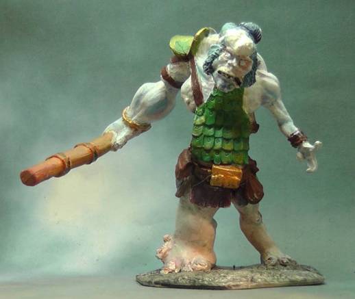
He said: “This was a mini that I started to like more while I was painting it. I chose a light blue skin with a red wash. Lately I have been experimenting with more exotic skin colors as you may have noticed.
I had some trouble photographing the mini. The red wash at first it did not show up on my photos at all, and even now it is less on the picture than on the real mini. On the mini the red rims around the eyes make the eyes stand out more and give the mini an even more sick-looking appearance.
The fomorian has to make do with old, ill-fitting armor (an interesting idea from the sculptor), so I chose to make it an aged green copper armor which gives the mini a lot of color and goes well with the blue skin.”
I really like the skin tone on this one, for some reason I envisioned painting my fomorian quite similar! Painter’s hive mind again, I guess. And you’re right, the armour’s color is a good choice that adds a lot of contrast, too!
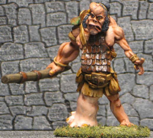
Timothy’s fomorian has the meanest glare:

This guy is definitely the winner in any staring contest – he looks like an aggressive maniac who’s ready to charge. And since you also picked a light human skintone, he could totally be some backwood mutant, ambushing a group of adventurers.
Michael’s fomorian is a fey;

He wrote: “I was going with the 4th Edition lore where fomorians are the tyrants of the Feydark, so to make him exotic, I went with blue skin. The tumorous and swollen right side has some pink blended in and purple wash. Being fey, his armor is copper, but I put a layer of verdigris from the subterranean dank. I think his evil eye came out pretty well too.”
I love the skin color, he looks really bloated and swollen and very non-human. The evil eye is also a cool idea. Overall the color palette is very harmonic, and the blond hair was a good choice.
This week’s gallery:


Coming next:
05/25/20 Bones IV Ettin (No. 99 on the KS pic)

Here is the link to Reaper’s graphic with all the core pieces, but it’s one and veeeery long picture so be prepared for some scrolling. On the other hand it has separate numbers for most of the pieces. I will add individual shop links as soon as they appear!
Here is the underdark Add-on.
06/08/20 Bones IV Baba Yaga (No. 96 on KS pic)
06/22/20 Bones IV Add-Ons: Underdark Gloom Stalker (No. 540 on the Add-on graphic)
07/06/20 Bones IV (Core Set) Movie night Part I: Paint Classic Horror Monsters (Mummies, No. 130 und 131)
07/20/20 Bones IV (Core Set) Bipedal Dragon Part One (No. 7) – WIPs, e.g. first colors, basing, modifications…

This is a big one, so we’ll stretch it over two entries!
08/03/20 Bones IV (Core Set) Bipedal Dragon Part Two (No. 7) – Finished Monster
08/17/20 Bones IV (Core Set) Movie night Part II: Paint Classic Horror Monsters (Vampires, No. 132 and 133)
08/31/20 Bones IV (Core Set) Bedeviled: Devils/Demons (Nos. 72, 73 and/or 74 on graphic)
09/14/20 Bones IV (Core Set) Movie night Part III: Paint Classic Horror Monsters (Victor’s Creatures, No. 134 and 135)

I think this mini may be the best Fomorian Giant of any I’ve seen. Most of them aren’t deformed enough and look like they spend too much time in the gym, at least for my taste.
Dirk – I thought he looked somewhat Japanese, too! Yours looks more tainted or diseased and I love the different sickening colors on the boils, warts, etc. Very grotesque. Maybe it’s just me, but I think he’s a natural for swampy or marshy terrain.
Arjen – I agree the armor needed to be old and in bad shape, with lots of either verdigris or rust. The skin color is an interesting choice and emphasizes the hideousness of the giant. I know what you mean about the pic looking different from the live mini. That can be frustrating!
Timothy – That’s one angry looking giant! I (obviously) like the human-like skin tone. He actually looks like he’s in pain and he’s going to take it out on you.
Michael – I like the blue with a bit of purple skin and the gear looks well beat up, too. The evil eye looks good and very intense. I was surprised when I did a little online research at the brightly colored Fomorians. I didn’t realize they were so different in later editions of D&D. Live and learn!
I tried to get a good coat of rust and verdigris on the appropriate parts to give the impression of age and ill use. I really like how deformed and asymmetrical he looks. I even painted mismatched eyes looking in slightly different directions. That’s one of the reasons they are difficult to surprise! Fomorians are supposed to be the most “hideous, deformed and wicked” of the giants so I tried to make him as unappealing as possible. Antonia, in case you were wondering: No kindness or remorse, just plain evil and cruel.
Very nice.
I can really see the Japanese influence in Dirk’s. His also looks the most … vile, maybe? Like the deformities are caused by something truly awful.
Jim’s reminds me a bit of a deformed version of the monsters from Attack on Titan. Pretty horrifying. I like the rusty armor a lot.
Arjen’s exotic skin goes a bit with my version, but definitely a different interpretation of the idea. The pale skin really evokes an underground look; I like the armor here too.
The skin tone on Timothy’s is human, but it seems … off (in a good way, here). It’s almost like it’s about to burst. I agree with Antonia’s description of seeming like a mutant. In any event, he looks nasty!