
Miniature Monday – Vernon, Ivy Knight
A white Paladin, the Green Knight or a Champion of Evil? Vernon could be all of those and more, have a look and see how our painters decided!
(posting by Antonia)
First of all sorry for being MIA without notice – the last couple of weeks the whole family had a severe cold, with my “traditional” winter bronchitis sitting on top, and when our little one had to stay home from daycare everyday routine was shattered completely.
Now everybody is getting better slowly, and I’m determined to put this article online this evening. At the moment, we have a hurricane strength windstorm ranging outside, and since that might mean that daycare is closed tomorrow (we’ll hear in the morning) it’s now or never 😀
The next week’s article will hopefully* work out just as scheduled, though.
(*What can I say? Sometimes I’m surprised by my own optimism.)
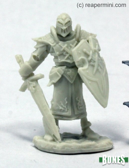
The miniature was fun to paint, with a lot of little symbols and leaves and well structured surfaces. The only weird (but maybe for technical reasons unavoidable) element is the “bridge” between sword and right foot. I saw that too late and therefore didn’t remove it, Dirk tried, but it wasn’t easy.
My color scheme was only loosely inspired by the mythical “Green Knight”:

I wanted to achieve an “ancient” look by using colors like bone or aged porcelain, pale bronze and only vague and subtle greens on the little leaf elements.
I like the nearly monocromatic result, although I have honestly no idea how and when to use this mini in a game.
Dirk went for a darker look:
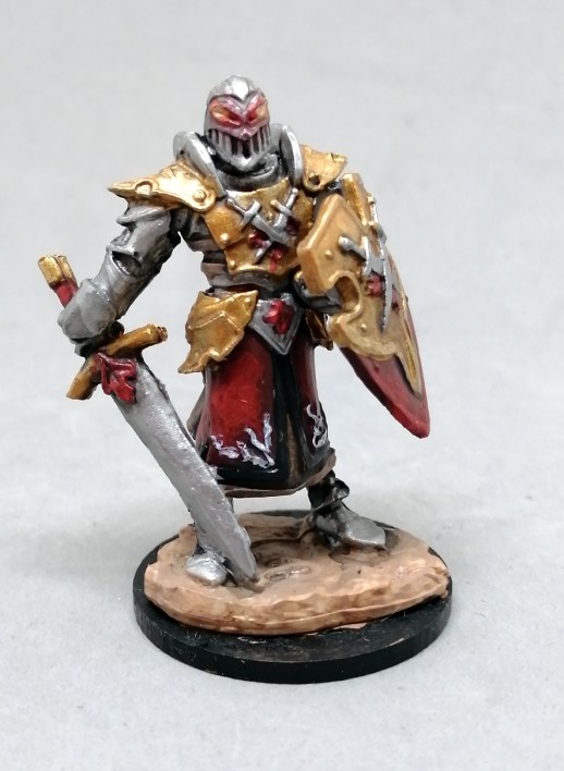
He wanted to paint Vernon as a sinister character and still keep the leaf details so he decided to go with a “red beech” red combined with black, gold and silver, and I think that works well for a balanced color scheme. He also added a bit of a glow effect to the eyes for extra interest.
Michael’s knight has more green than mine: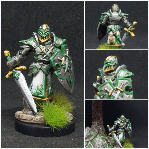
He said: “I liked the model, though I don’t know what the deal with that stone bit by his right foot and sword point is about. I probably should have cut it out, but I didn’t have time. I took his name as inspiration to use a lot of green, and I’m happy with the overall look. I added a few little grass tufts for interest, but I also included a shot using a new piece of Dwarven Forge terrain to have him traipsing through the forest. ”
Timothy painted a silver-clad Vernon:
He also used blue and green, but still the look is completely different! The yellow brim of the tunic is a nice touch and keeps the whole composition from being imbalanced!
Arjen sent us the (Imho) “Classical” Green Knight:
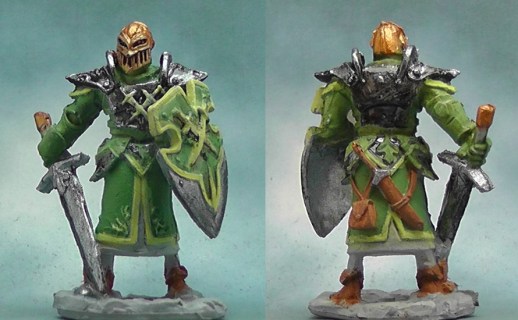
He wrote: “I liked this mini, lots of detail and character. The evil-looking helmet has a theatrical appearance, reminding me of gladiator helmets, so I chose gold to remain in that style. It would be easy to give this one a black and red outfit to make him totally evil, but I chose for more ambiguous colors: with green and yellow it is not exactly clear whether this guy is evil or just trying to scare his adversaries. In my mind he is more of a mercenary or tournament fighter now.
I tried a dark wash on the shield to bring out the details, but it looked like someone had spilled coffee on the shield, so I re-painted over most of it, leaving just a bit of shading under the crossed swords. Some of my previous minis ended up looking cluttered after I tried to do all kinds of shading and picking out small details, so I decided this time to try to get a somewhat crisp overall look. As a result, I did not bother with shading, and picking out too much details like rivets. I am almost content, but the silver armor still looks murky rather than worn, something to do with the dark metal paint that tends to de-mix.
Also, at the last moment I cut away the lump at the bottom of the sword, but ran out of time and not quite finished repainting there.”
Jim let his inner child do the painting:

He said: “I went super simple this time around. My 12 year old self was present in my color choices and painting “style”. I thought this guy would look good in black and gold which makes him look a bit sinister. Being an Ivy Crown Knight, however, I think he is actually supposed to be good? Also, I did absolutely no highlighting on this one and the only shading is a wash. Funny, I think it looks fine for a table top mini! I may go back and spruce him up a little, but I’m not holding my breath.”
Thanks, everybody! Here’s the gallery:


Coming next:
02/17/20 Bones IV Minotaur (from the “Sophie and Friends” group at the bottom, No 162 on the KS pic)

Here is the link to Reaper’s graphic with all the core pieces, but it’s one and veeeery long picture so be prepared for some scrolling. On the other hand it has separate numbers for most of the pieces. I will add individual shop links as soon as they appear!
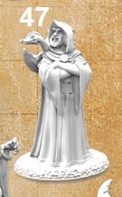
03/02/20 Bones IV Sorcerer with attitude (and dragon familiar) (No 47 on KS pic)
03/16/20 Bones I-III Anwyn, female bard
03/30/20 Bones IV Rat ogre/were-rat (No 12 on KS pic)
04/13/20 Bones IV Add-Ons: Underdark (mini type TBA)
04/27/20 Bones IV Core humanoid
05/11/20 Bones I-III TBA
05/25/20 Bones IV Core monster
Maybe some minis from an add-on after that? I read some suggestions in the direction of the Underdark box with myconids, drow etc.?
I added some first picks from the Bones 4 Core Set, some monsters, creatures and villagers. The adventurers I’ll check next, the group was just too large for a quick pick. Any more suggestions?
–> Since reaper re-organized their online shop recently, some of the links might not be working anymore. Until we come around to fix that you can always use the miniature’s name and use the search box on top of the page.

“when to use this mini in a game”…I think Antonia’s mini would do very well in the rosegarden of a palace where it guards the royalty, for of course it is a posh living statue.
Antonia – Cool effect. He makes me think of ivory or marble. I like Arjen’s living statue idea!
Dirk – He certainly looks evil! The glowing eyes worked well.
Michael – He reflects the Ivy Crown part of his name without a doubt. Interesting how color can change the feel of a mini!
Timothy – That blue, green and yellow look really great together. I can’t decide if he’s good or evil?!
Arjen – Even greener! I agree about the ambiguity concerning good and evil. I think the helmet tips him towards the bad side.
What can I add? Mine is pretty basic. I did manage to get rid of the excess plastic by the sword. Not sure if it was supposed to be there, but it bothered me.