
Miniature Monday – Brotherhood of the Seal
Miniature Monday – Brotherhood of the Seal

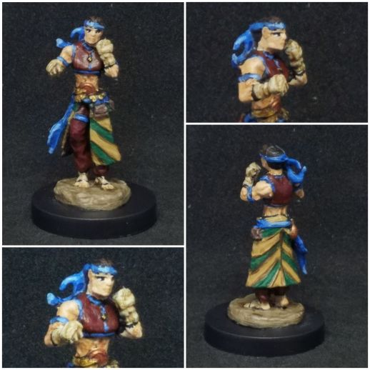
This week’s mini is a pathfinder iconic, a martial artist ready to strike! (posting by Antonia)
This is a miniature Tuesday again, this time even intentionally because yesterday we celebrated my birthday 😀 In case you are wondering – I didn’t get that many minis, but a lot of paints and books on writing and sci-fi art, which are some other of my numerous hobbies and/or occupations.
Although this week’s mini wasn’t exactly “pretty” in detail or overall looks, I was a bit intrigued by the fact that you can see it as either male or female (or neither) depending on how you look at it. I mean, “Brotherhood” heavily implies a male monk, but the body outline could allow for a female monk (in the D&D class sense, where everybody is a “monk” regardless of gender) too.
I have to admit that the details are quite blurry and I often just guessed what was skin and what whas clothes/wrapping, plus the monk definitely got a lot of hits in the face… but not everybody needs to be pretty, I guess 😀
I kind of defaulted on the colors:

At first I wondered if I should paint the mini in red, as I somehow pictured her as Marvel’s Elektra, but I never really liked the character, so I used green and red instead, with a brown skin, because I know that works well together. Maybe I can used the monk somehow in my Sci-fi RPG setting, we’ll see.
Dirk decided to watch the skies:

As he wanted to portrait a character concept from ages ago, a martial artist in the “Ninjas and Superspies” setting who works with flowing moves inspired by wind, waves, clouds etc. So he picked light blues and whites, and while the mini is a WIP I think the color scheme is quite interesting.
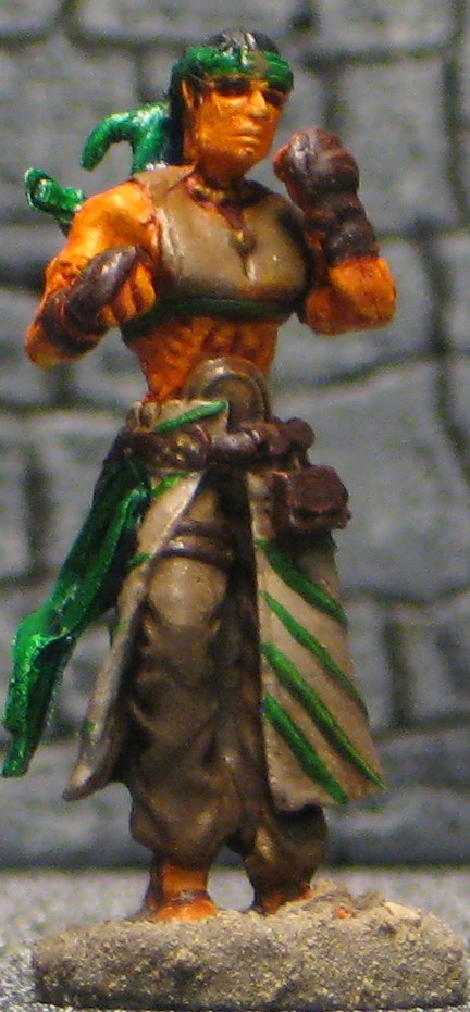
Arjen chose more unusual colors:

He wrote: “I had some difficulty with this mini. The details of the skirt were very good, but the face was so weak that the features could not be brought out by a wash. I am not a fan of this mini, so I decided to use it to experiment with it, using more light and dark contrast than usual, but my blending went not very well. I decided to stay away from the obvious monk colors of white and brown, so I chose a bright sporty purple. Although it is a badly executed paint job, I like how the colors turned out.”
Great idea to use a not-favourite mini for experimentation, I will remember that trick – motivation is sometimes hard to come by and learning/trying new things without fear of messing a “useful” mini up could just bring that!
Michael also tried some things:
He wrote: “My model for this week is attached. I wasn’t super inspired by this sculpt, and for a while, I thought of doing something ridiculous, like making him look like a marine mammal. In the end, I chose a slightly less silly theme, as this model features the following Reaper paints: Dragon Red, Dragon Green, Dragon Blue, Dragon Bronze, Dragon Gold, and Dragon Copper. It came together pretty well though.
I’m actually glad that we are staying with every other week for submissions. For all I said I could use the motivation, I just haven’t had a lot of time lately, as always happens when the semester starts. My Mi-Sher has a coat of solid Walnut Brown (my standard fake-priming on most models to ensure the deep recesses are dark), but has been staring at me for a few weeks now untouched. Perhaps this Sunday…”
Again, I like themes and ideas, even silly ones, if they make you paint, and you never know how your projects end up! The blue is a great spot color!
A brown undercoat is an interesting choice, do you have the impression that the colors on top seem “warmer” overall?
Timothy went for a strong contrast:
I like the mustard yellow combined with the deep blue, as it gives a new twist to the classic earthen monk colorations. The pink ribbon is definetly unusual as a spot color, I feel that way you could use the mini in modern settings as well!
Timothy didn’t give any info on why he chose the colors and what he will use the mini for, do you care to tell us in the comments?
And thank you of course for your contribution, it’s always cool to see new painters and styles here on the blog!
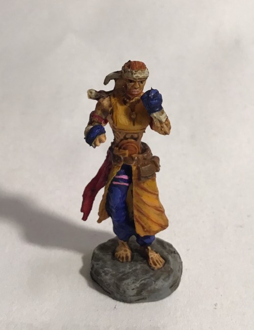
Jim’s monk is a desert dweller:
He said: “I can’t say I like this mini very much. I’m not fond of the style or aesthetics for a start. It’s definitely a mini I would never buy individually. In addition, my copy is not very well cast and the detail is pretty soft. The colors are really just desert inspired with the green being a common color in real world desert cultures representing life and growth.
Fortunately, there are some fun minis coming up on the schedule!”
I agree that the mini has its flaws, that makes it even cooler that all of you tried to make the best of it! The importance of green for desert cultures seems obvious now that you point it out, but I somehow never made the connection before. Learning new stuff every (other) monday! I like the combination of green and grey btw.
Which minis are you looking forward to paint most?
This week’s gallery:


Coming next:
09/30/19 Bones II Mi-Sher, Sword Dancer (B2 Core)
I added some miniatures to the schedule now. We might still shuffle them around, do extras (like “Show me your project!”) or add more, just tell us what you think in the comments!
–> Since reaper re-organized their online shop recently, some of the links might not be working anymore. Until we come around to fix that you can always use the miniature’s name and use the search box on top of the page.
Bones 4 finally! Yay!
Since the miniatures don’t have separate pages in the shop yet, I’ll link to the “packages” they seem(ed) to sell.
Here is the link to Reaper’s page with all the core pieces, but it’s one and veeeery long picture so be prepared for some scrolling. On the other hand it has separate numbers for most of the pieces.
10/14/19 Bones IV Dire animals: Crab (B4 Core) Nr. 55 on KS pic
10/28/19 Bones IV Villagers: Younger Man with stick (back row, left) (B4 Core) Nr. 50 on KS pic.
11/04/19 Bones IV Villagers: Woman with bucket (far right) (B4 Core) Nr. 149 on KS pic
11/18/19 Bones I-III TBA
12/02/19 Bones IV Monsters: Wyvern (B4 Core) Nr. 81 on KS pic
12/16/19 Bones IV Villagers: Bandit with Dagger & Sword (front row, right) (B4 Core) Nr. 100 on KS pic
I added some first picks from the Bones 4 Core Set, some monsters, creatures and villagers. The adventurers I’ll check next, the group was just too large for a quick pick. Any more suggestions?

My apologies. I didn’t mean to sound overly negative. I’m a little relieved to see other’s opinions an this mini.
Antonia: Interesting idea that it could be male or female. Maybe one or the other in disguise.
Dirk: I might like your color scheme best. It definitely fits your character concept.
Arjen: A good one to experiment on! I like the lavender/purple no matter.
Michael: Clever use of a themed group of paints! In the end, the colors work well together.
Timothy: Welcome and thanks for contributing. I like the deep blue and yellowish tan contrast. His facial expression is truly grim!
Not much to add about mine other than there’s a bit of shine in the pic and that flesh wash is REALLY red! At least he’s done.
To answer Antonia’s question: I’m looking forward to the villagers as I already have the Kullhaven set and need to get some more of them painted up. Of course, the crab and wyvern look like they’re going to be fun, too!
I think a few of us mentioned some issues with the sculpt, but these definitely look nicer once they’re painted up. I found myself making up little stories for these.
Antonia’s green and gold pattern looks to me like it could be a pattern indicating this monk’s school or affiliation. The red belt (great contrast color) could be an indicator of her rank.
Dirk’s definitely looks more sky-based. Maybe a monk who lives on an isolated mountain peak, guarding a hidden shrine.
Arjen’s with the flashy purple and blond hair makes me think this monk is a performer of some kind. Maybe the fantasy equivalent of a pro wrestler?
Timothy’s monk has that excellent color contrast. This monk to me looks like he comes from a city with a strong warrior society tradition rather than a rural monastery.
Jim’s is the opposite; I think his monk is definitely in tune with the land. Maybe he’s even multiclassed into druid!
So, I’m not sure if the Walnut Brown undercoat I give makes the colors warmer because I very, very rarely do anything other than that and don’t have a real point of contrast. I do find it helpful for a few reasons. First, the white color of Bones plastic doesn’t show the detail that well; this is somewhat corrected by the gray color they seem to be using now. Second, I can slather it on everywhere, into all the deep places that I don’t really have to paint into with a real color, and it will give an appropriate shadow appearance (better than black, in most cases). That can be really useful when there’s a big gap between, say, the torso and a big backpack. It’s also sometimes useful just to leave a little line of dark brown in certain places to emphasize a contrast – between the forehead skin and hair, for example.