
Miniature Monday – Athak, Undead Knight
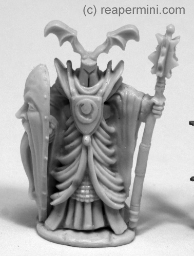
Most times the undead are easy to recognize by their pallid, often rotting flesh, sometimes their whole bodies are even reduced to bare bones.
With this week’s miniature we’ll never know, since Athak is completely clad in heavy robes which allow for a variety of styles and colors . Let’s see what our painters did with it!
(posting by Antonia)
When I first took a closer look at Athak, the mini reminded me a lot of some of the classic Warhammer/WH40k illustrations, with its grimacing shield and flowing robes. The pose also has a very “retro” feel to it.
Concerning mould lines I had some on the helmet’s “bat wings”, and the mace/staff needed a hot bath to straighten them out, otherwise the sculpt is quite nice.
(The name, though… A knight called “Attack”? Really? *lol* )
As I mentioned I was heavily inspired by Warhammer illustrations and decided to make Athak a disciple of Tzeentch:
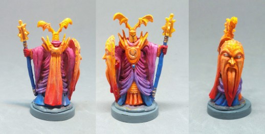
As you might know, Tzeentch, The Master of Change and Mutation, doesn’t have just one signature color but many, mostly in the spectral area of blue, pink and yellow, so I used those colors and their intermediates.
I used wetblending and mixes of red and blue washes to keep the colors bright and the transitions smooth.
The results are, well, special *laughs* as the mini is quite blindingly colorful, really psychedelic, but I like how the gradients came out and for Tzeentch, this guy looks very cool of course 😀 For battlefield use I would tone down the colors significantly to make sure the models don’t outglow the whole table, but hey, it’s chaos magic, so, as an experiment and stand-alone mini I’ll keep it that way and wonder if when during our WH40k campaign we might meet a cult of Tzeentch.
Dirk made some small changes with a big impact:
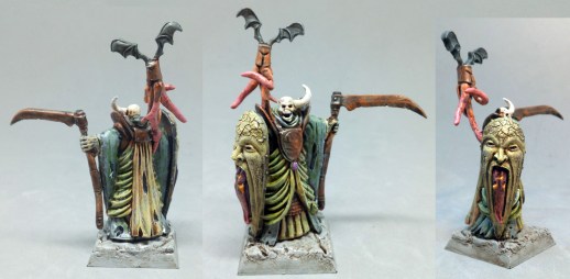
At first he didn’t quite know what to to with Athak, but after he decided he wanted to make him an undead champion of Nurgle, Warhammer’s deity of rot and plague. He replaced the head with one from a crypt warden (also Bones) and gave it the characteristic asymmetrical horn. The mace was swapped for a scythe and he cut off the symbol of the breastplate – at first he cosidered adding nurgle’s symbol instead but found that the uneven surfecae itself looked nice, in a rotten, word off way.
For a bonus, undead Athak got a familliar, made from… well, his own head, with some feisty tentacles sculpted out of greenstuff.
After using pale greys and beiges as base colors, Dirk colored the mini more or less completely with brown and green washes, which works fantastic to convey a “painted” look and a sense of stinking, rotting, mouldy decay.
As a special detail he used crackle paint (Citadel’s “Agrellan Earth” in this case) to create a crackled, unhealthy surface on the shield’s “face” – awesome effect!
Michael had an unsettling idea about the shield:
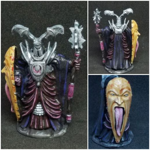
He wrote: “This was fun to do, and I got to use a few new paints from Reaper’s Dungeon Dwellers line. I decided that his shield had a stretched out giant’s face on it, so it’s a little gory.”
Very cool and disgusting idea, congrats! The pale pink of both tongue and cloth highlights work well to connect the face/shield with the rest of the miniature. I can easily imagine this one as some kind of evil overlord/end boss NPC, do you have plans on how to use him yet?
Arjen’s Athak also sports an extraordinary color scheme::
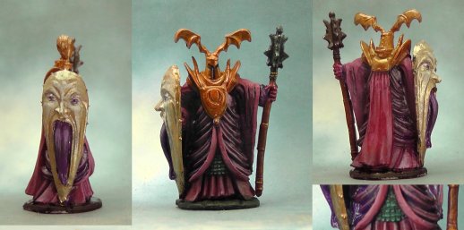
He said: “I said some time ago that I put pink on my list for one of the next miniatures, so I thought this one was well suited. I like how extravagant this mini is with the huge head-shaped shield, the thick robe and the strange wing-antler things on its head. I first painted the armor black, but in keeping with the extravagant mini, I added some green for contrast, although it does not show well in the middle picture, so I added the small close-up in the corner.”
I like your color choices a lot, the pink and the metal tones create an eery, somehow otherworldly combination, and the green works indeed to contrast and balance the rest. Very unusual! Your venture out of your comfort zone (if I recall your motivation correctly) was quite worth it!
What color did you use on the shield? Is is a very pale gold or something like mother-of-pearl?
Jim’s knight has a very distinct style:
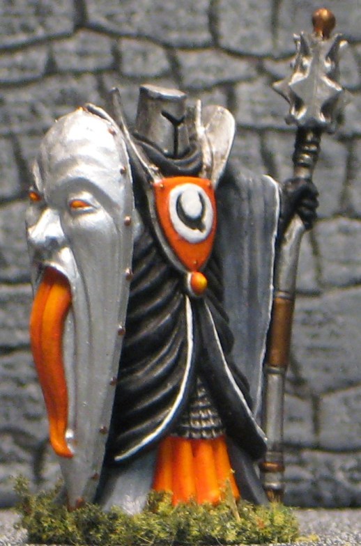
He wrote: “I ended up making a slight modification to this mini as the bat wings didn’t really seem to fit with the rest of the mini. Just my opinion, but it also helped make the helmet seem the correct size instead of too small. It took me forever to work out a color scheme. I started with black/gray/white but ended putting a little orange in for contrast. He doesn’t really seem very undead now but could still be used as an evil cult leader or subject of worship.”
It may sound strange, but the first “vibe” I got when I saw your picture was “Retro-Scifi Robot”. Like one of the classic Cylons or something Cpt. Kirk or Flash Gordon might encounter (and, of course, battle!). It might be the bright orange which doesn’t fit well into medieval cliché, but anyway, the color scheme is super neat and impressive in its simplicity. Well done!
This week’s gallery:


Coming next:
04/01/19 Bones II Alain, Paladin (B2 Core)
I added tons of miniatures to the schedule now. We might still shuffle them around, do extras (like “Show me your project!”) or add more, just tell us what you think in the comments!
04/15/19 Bones III Were-Crocodile (B3 Core)
04/29/19 Bones III Skara, Female Skoli (B3 Core)
05/13/19 Bones – Catch-Up Monday (Your choice of Bones I-III!)
05/27/19 Bones III Eastern encounter part 3 – Kitsune! Female and/or male.
06/10/19 Bones III Gwyddis, Dwarf Valkyrie (B3 Core)
06/24/19 Bones II Sir Conlan (B2 Core)
07/08/19 Bones III Durok, Dwarf Ranger (B3 Core)
07/22/19 Bones III Wraith (B3 Core)
08/05/19 Bones II Alistrilee, Elven Archer (B2 Core)
08/19/19 Bones III Sigurd, Viking (B3 Core)
09/02/19 Bones III Brotherhood of the Seal (B3 Core)
09/16/19 Bones II Mi-Sher, Sword Dancer (B2 Core)
After that Bones 4? Or should we start earlier? Until then everyone should have had the chance to check their shipments or even bought some minis directly from the shop.
We’ll gladly accept your suggestions!

Regarding the shield: The base is a mix of gold and silver, to get a pale gold look. For the highlights (cheeks etc.) I mixed in some very light blue. That way, the color becomes more vivid than if you just mix in some white.
I like how everybody went out of their comfort zone with this mini. Antonia’s is really dazzling (I though I had bright color choices…boy was I wrong), Dirk’s cracked shield is a very nice touch (I think, though, the familiar is only soso and is distracting from the nice mini), Michael came up with a brilliant explanation for the crazy looking shield, and Jim’s choice of orange is indeed outside the heraldic approved colors and gives an unusual feel to the mini (and those eyes in the shield seem to glow!).
This is one of the most colorful Miniature Mondays I’ve seen! I think the model is in a way kind of cartoonish, and I see a lot of illustrated or animated villainy with it. I was kind of going for a comic book illustration with mine, making sure the shadowed folds of his robes were very dark so the bright highlights stood out. The blue-toned metal color is Skeleton Key from one of Reaper’s Dungeon Delver paint sets. I don’t have any concrete plans for this mini in-game, but I’ve got a few creepy dark knight or wizard models painted now, so I might throw them all together for a nasty encounter.
Antonia’s is just wild, but the colors do work. Like, it’s garish, but it flows really well. It’s insane, really.
Dirk’s does bring that rot sense. Great modifications, especially the little holes in the cape. That’s a very cool use of the texture paint too. I used that same paint on the base of a model I’m going to send in on our next catch-up date, but it’s so interesting to use it on the surface of the model itself.
Arjen, I was thinking pink too (on the heavily folded sides), but you went all the way. It looks great, and I agree with Antonia that the shield color is very cool.
I think it’s interesting how much more of a martial feel I get with Jim’s, once the bat-wing decorations are removed from the helmet. I feel that others might be warlocks or something, but Jim’s is just going to bash you with that mace-staff. Great job with the subtle blending on the highlights (as usual; seriously, you’re great at that!).
My eyes! I’m blind! All kidding aside, everyone made good use of color. “Undead knight” was an odd subject to try to paint.
Antonia – Not only original and psychedelic, but well executed too. He (?) definitely has that Tzeentch taint about him.
Dirk – What can I say? I like yours best, not least because it actually feels undead. The rusty metal, the cracked flesh and empty eyes on the shield, the tattered fabric, the skull head and of course that familiar all look great. Those tentacles could pass for intestines or something even more foul!
Michael – Nice color choices and the shield is a really cool idea. The contrasting color draws one’s attention to the shield which is the best part of this sculpt, in my opinion.
Arjen – I really like the pink and purple tones. It’s no insult to say that the mini is beautiful! I’m struck by the green (verdigris?) armor and think that the rest could have been done that way too. Not nit picking, just thinking out loud.
Mine, well, I’m the only one that didn’t use pink in some way! I like the retro comment; sort of a Robbie the Robot gone bad. I wanted the shield to be very shiny and intimidating and look like it was hammer into shape so not too much depth/shading. I’ve definitlely decided he’s an evil cleric not an undead knight at all. The colors are similar to the cultists in “Conan the Barbarian” and I can see him directing combat from the rear showing no fear or other emotion, just sinister confidence.