
Miniature Monday – Alain, Paladin

In the name of all that is good and shiny – a group of paladins has gathered to show off their armour! Admire them here…! (posting by Antonia)
This week’s mini snuck up on us, not in the “wow, for a guy in full plate he’s surprisingly sneaky” way but more like “Woah, wait, has it been two weeks already?!”
The mini itself is sculpted in a realistic style with a lot of well proportioned, fine details, combining a lot of gear with large surfaces perfectly suitable for freehands. The face is smooth and the eyes are comparatively large, so you could certainly use Alain for a grumpy female Paladin too, if you accept a realistic but not very feminine* silhouette, for something like a “Jeanne d’Arc” or “Brienne of Tarth”-type of character.
*(More on this just? Google “boob armor”, you’ll know what I mean)
I didn’t have much time, but you get the idea:

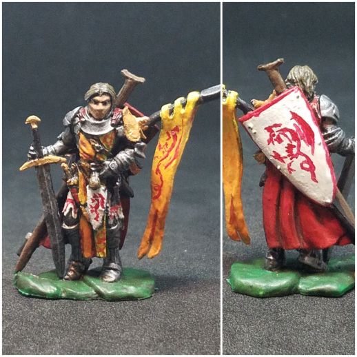
This is not much more than a WIP, base color and a wash, but due to the fine details you can see where I am going. As I sometimes do, I drew inspiration from our LARP background which has the “Order of the Dragon” clad in red with a black dragon symbol on top. Since it’s a WIP the dragon and other freehands are still to be done, but since the shield gives much area for that it’ll be fun to paint. I’m also looking forward to do a nice color transition on the banner.
Arjen sent us a Alain as the Green Knight:

He wrote: “This mini was modded because my Pathfinder group needed a cleric of Erastil (nature god) with a spear. So the heavy armor was painted a bit more like medium armor, the little shield near his groin was removed and replaced by a satchel and the sword became a staff. Green was a logical choice, with the symbol of Erastil (stag head) on the shield. I am not sure about the leaf pattern on the banner, but did not come up with a better plan yet.”
Great work with the conversions! Modifying a model is a good way to individualize it, and your are so decent that they are well integrated into the model and don’t stand out too much.
I like the freehands! Can you tell our readers how you made the leaves and stag? Did you use watered down color?
Michael was well prepared this time:
He said: “I painted the Alain mini back in 2016, and as you can see, I was directly looking at the Pathfinder art. One of my friends had made a character based on that art who died in one of my games, and when I resurrected the character (as more evil than he had been), I had the painted model ready. There was a ton if delicate freehand of the designs (I look at it now, and think I could probably do better, of course), but I also remember this being the first time I successfully got a color to blend well – the yellow to orange on his banner.”
Good job with the color gradient, its really perfectly smooth. And the overall color sheme is very warm and balanced.
Again, I like the freehands (we have a lot of them today). Is the animal in your heraldry a cockatrice? Again the question, can you give our readers a tip how to make such freehands? Did you have a reference? Did you sketch it beforehand?
For Jim, this mini was the perfect choice to paint:
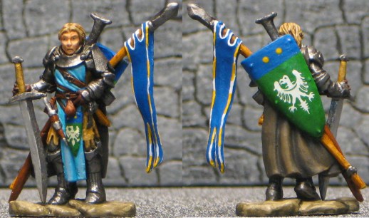
He wrote: “After last time, I needed a mini that was right in my sweet spot! He’s a pretty standard fighter/knight/cavalier/paladin but he certainly does have a lot of equipment. I’m still working on a head for his flail and also the banner, but I’m happy with the almost final results. I also want to fix his face a little though it’s not really visible in the pic. As I was painting and choosing colors I slowly realized that I was painting a combination of Jaime Lannister and Sting.”
Like always, I like how you get all the details, and the stripes on the rim of the banner are a good idea. The blue/green color combination gives a cooler feeling and looks great. Where did you get the eagle heraldry from? Is it a decal?
This time we had a lot of different color shemes, and each one looks great and gives the mini a distinct style. And the mini really gains a lot through heraldry, freehand or decal in equal measure!
Dirk will try to finish his knight. He has great plans for him and still works on a mustache. We will update his mini when it is presentable ;).
This week’s gallery:


Coming next:
04/15/19 Bones III Were-Crocodile (B3 Core)
I added tons of miniatures to the schedule now. We might still shuffle them around, do extras (like “Show me your project!”) or add more, just tell us what you think in the comments!
04/29/19 Bones III Skara, Female Skoli (B3 Core)
05/13/19 Bones – Catch-Up Monday (Your choice of Bones I-III!)
05/27/19 Bones III Eastern encounter part 3 – Kitsune! Female and/or male.
06/10/19 Bones III Gwyddis, Dwarf Valkyrie (B3 Core)
06/24/19 Bones II Sir Conlan (B2 Core)
07/08/19 Bones III Durok, Dwarf Ranger (B3 Core)
07/22/19 Bones III Wraith (B3 Core)
08/05/19 Bones II Alistrilee, Elven Archer (B2 Core)
08/19/19 Bones III Sigurd, Viking (B3 Core)
09/02/19 Bones III Brotherhood of the Seal (B3 Core)
09/16/19 Bones II Mi-Sher, Sword Dancer (B2 Core)
After that Bones 4? Or should we start earlier? Until then everyone should have had the chance to check their shipments or even bought some minis directly from the shop.
We’ll gladly accept your suggestions!

Yep, that’s a cockatrice on the banner on mine. The model is Pathfinder’s Iconic Cavalier, and if memory serves, there’s an Order of the Cockatrice that is mostly pretty self-serving. I did all my freehand by just going for it and hoping I didn’t screw up! It was a long time ago, but I think I did go back with the white a little bit to thin out my red lines here and there, especially on his thighs. I actually wish I had done a little more with the white before putting the red on; since I painted this, I developed a better technique of painting up from Army Painter Ash Gray to get a better gradient of white.
I think Arjen’s is my favorite this time. The conversions and paint choices really change the whole character. I actually love the leafy vine on the banner. I’m trying to think harder about my color choices so all my characters of a certain type don’t all look the same, and this is a great example of changing out a strictly martial feel for something more nature-based.
It’s funny that Jim mentioned Jaime Lannister; I think Antonia’s right now actually fits that bill! Antonia, I really like the way the metal came out. It’s nice and shiny, but has nice shaded spots too. Jim’s has some really innovative heraldry – great use of cool colors and patterns. Also, the really rich brown tones on the cloak look nice and tell a story – even though he’s a dashing cavalier, he’s still got a practical cloak for travel!
For the leaves on the banner I used watered down paint. Initially I was planning to add more paint, but I liked the slight transparency, as if the light is shining through the banner.
For the collar, I painted ithe edges silver and then put on a layer of green in the middle, as if the paint is worn away and the metal beneath is visible. Unfortunately, this is not very clear in the picture.
I am wondering about Antonia’s collar and other metal parts: is it some sort of NMM, did you highlight with white mixed with silver, or is it some other technique? it looks nice.
Antonia – I like where you’re going with him. Red and gold always work well together
Arjen – He looks great and the conversion works perfectly. I love the stag’s head and the leaf motif, I wouldn’t change it.
Mike – Red and gold again! It looks good, especially the freehand work. I have to admit, while yellow looks good on knights, I hate to paint with it.
I love painting “knights in shining armor”, so this one was too much of a stretch. I originally was going to go with a grey surcoat that, with the brown/green cloak would give look of a veteran campaigner, but I ended up with light blue giving him a little cleaner look. I still like it. The eagles are decals from Vini Vidi Vici and were chosen to give a King’s Man feel.