
Miniature Monday – Werewolf
The full moon rises, and it draws out all kinds of big, furry, heavily clawed animals… maybe even the occasional X-Man. For now, let’s have a look at the werewolf!
(posting by Antonia)
Werewolves are a staple of classic movie monsters and can find their use in fantasy and even sci-fi settings like Shadowrun – and now I wish I had thought of this earlier because I love to genre-swap miniatures. I could have converted the wolf into some cybered creature, like I did with the minotaur recently, or given him a gun and a belt to make him a sci-fi mechanic co-pilot mercenary…. Well, next time.
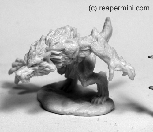
The miniature itself is quite massive, with nice detail on the sculpted fur, and although the bent over pose is a bit dramatic it’s still possible to paint without too much trouble.
Dirk chose a classic dark color scheme:
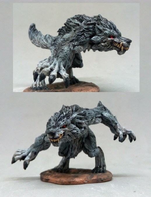
He painted the werewolf with dark greys and black, and I love the result, especially in combination with the red eyes. It’s cool how the color variation within the fur (darker on the back and arms) make it look natural without much effort. And this snarly grin looks wonderfully vicious, doesn’t it?
I tried something else:
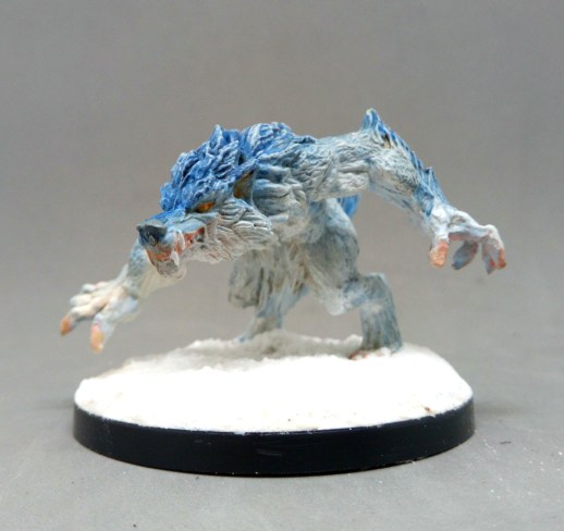
Since I got all my good ideas *after* painting the mini I wasn’t sure how to paint this one, as I was sure we would get enough of the classic or natural looking wolves and I wanted some variety for fun’s sake (this is what Mini Monday can do to you, really!). When I checked the other were-creatures from that Kickstarter I noticed that the were-boar combines well with the werewolf because they look like they are charging right at each other. They will have an epic clash, and since I think the were-boar’s mane looks a lot like fire, I painted the werewolf like ice for a contrast.
The boar is not ready yet, but I could at least play around with blues on the wolf. Note how the claws are light flesh colored because I figured a pale-ish skin type would have transparent nails too.
The snow is baking soda, btw., we should really do a post about using cooking supplies for basing 😀
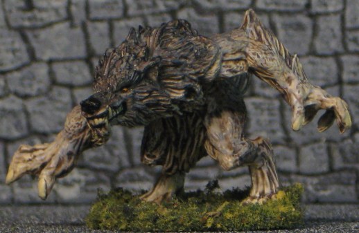
Michael’s werewolf is of the grey variety:
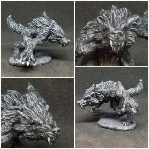
He wrote: “Here’s my werewolf. Nothing too fancy – a lot of drybrushing and then some detail work. I did coat the base with Citadel’s Astrogranite texture paint for something a little different.”
Did you use only grey and black beside the eyes? It’s an interesting effect, as if the wolf was a stone statue himself. And the texture paint, how does it work? I can’t really discern it on the picture, are there pieces and grains included to roughen up the surface? Never tried that one, I’ll have to check it out at the store.
Arjen’s wolf looks continental:
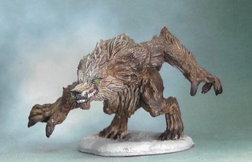
He said: “To be honest, this was a very easy mini to paint. Just some drybrushing for highlights. the mini has very good detail that is easy to bring out. I chose a classical look.”
His palette includes brown, that’s why I thought of an european or eurasian wolf – I’ve been studying eurasian wolves and their coats show a lot more brown than their new world counterparts. The lighter face is a nice idea, it provides good contrast to the dark lips. Do you have any plans to use this mini on the tabletop?
Jim’s sense for detail struck again:
He wrote: “I did manage to get my Werewolf done (in one night!) and I’m pretty pleased with it. It’s a little rough but the head, face and eyes worked really well on this one. I managed to get the irises AND pupils. I like this one because it’s a very ferocious sculpt which is appropriate.”
The eyes look very cool indeed, I was glad I could paint them properly in just one color, didn’t you find them too tiny? Pupils certainly add to the threatening look for! I also like how you created a color gradient that draws extra attention to head and face.
INFO: I just updated the “Dub Bullock” post from last time with a very cool new picture!
This week’s gallery:


Coming next:
03/18/19 Bones III Athak, Undead Knight (B3 Core)
I added tons of miniatures to the schedule now. We might still shuffle them around, do extras (like “Show me your project!”) or add more, just tell us what you think in the comments!
04/01/19 Bones II Alain, Paladin (B2 Core)
04/15/19 Bones III Were-Crocodile (B3 Core)
04/29/19 Bones III Skara, Female Skoli (B3 Core)
05/13/19 Bones – Catch-Up Monday (Your choice of Bones I-III!)
05/27/19 Bones III Eastern encounter part 3 – Kitsune! Female and/or male.
06/10/19 Bones III Gwyddis, Dwarf Valkyrie (B3 Core)
06/24/19 Bones II Sir Conlan (B2 Core)
07/08/19 Bones III Durok, Dwarf Ranger (B3 Core)
07/22/19 Bones III Wraith (B3 Core)
08/05/19 Bones II Alistrilee, Elven Archer (B2 Core)
08/19/19 Bones III Sigurd, Viking (B3 Core)
09/02/19 Bones III Brotherhood of the Seal (B3 Core)
09/16/19 Bones II Mi-Sher, Sword Dancer (B2 Core)
After that Bones 4? Or should we start earlier? Until then everyone should have had the chance to check their shipments or even bought some minis directly from the shop.
We’ll gladly accept your suggestions!

Great work by everyone.
Cheers,
Pete.
Interesting how Dirk somehow got much more contrast than Michael. Did you paint it almost white with a black wash? And did Michael use dark grey with a white drybrush instead?
I used dark grey for the fur with light grey on the belly, hands, legs and lower side of the tail, while I painted the back from head to tail with black.
I then washed the whole mini with dark tone army painter (a black wash).
As highlight I used dark and then light grey for drybrushing.
The wash creates a very strong contrast, which I wanted to give the fur depth, and I’m pleased with the result. The color Gradient in the fur looks better in real then in the picture, but you can see it in the claw and the tail.
Dirk
The wash must be the difference, then. On mine, I completely coated it with Pure Black, then used Reaper’s Wolf Gray as my drybrush. I then did the tips with something lighter, but I don’t remember if it was white or a lightened version of the Gray (I did this back in early January). I was experimenting to see how fast I could get a model tabletop ready and skipped a wash step here, but Dirk’s model shows that that was a mistake, as it looks great.
Also, I probably should have washed the texture paint on the base. This particular one has little granules to give a rough texture, but some shade would have made it stand out better. This is another area where Dirk’s looks fantastic, as the brown base makes all the gray-dients (lol) stand out.
Antonia’s looks magical/supernatural. I like it very much as a nifty monster concept. Both Arjen’s and Jim’s have a classic look; comparing side by side, one is lighter in the face/top area and the other darker. For Arjen, it looks more like highlighting from a light source above, whereas Jim’s looks like the countershading pattern you find on a lot of animals.
Where-wolf? There wolf. There castle.
Nice variation in tones from cold (Antonia) thru neutral (Dirk, Michael) to warm (Arjen & myself).
Dirk’s is true classic and his painting technique is almost the same as mine, just with a black wash instead of my brown wash.
Antonia’s icy wolf works great (nice idea). This mini is a perfect example of the ideal for Bonesium: Medium to large size and relatively large, coarse detail with lots of depth. I’m looking forward to the were-boar, too!
Michael’s looks like it is outside, at night under the light of a full moon with colors loosing their distinctness and fading to an almost black and white effect. Only a pair of red eyes to warn you of impending danger! Sometimes fast is best.
Arjen’s brown looks great amd those green eyes really emphasize the un-naturalness of the beast. It’s amazing how much variation there is in wolves worldwide.
I’d love to take credit for that face, but it’s 99% the sculpt! I used the same pattern as my wolves and wargs: A base of off-white overall grading up to black along the top with a brown wash instead of black just to break up the grays. The eyes were surprisingly tiny but not too small and the pupils give you that feeling that it’s coming right for you!
Ha, I actually found out what the real difference was – photography and lighting. I went and dug out my werewolf, and it is MUCH darker than it appears in the picture, with better contrast. I briefly tried taking another picture just in the ambient light, but then it was super dark and shadowed. Ah well.