
Miniature Monday – Gloom Stalker
There are a lot of dangerous creatures that a group of adventurers might encounter in the caverns beneath their world, and this week, we take a look at some especially scary claws. Or was it horrifying hooks…?
(posting by Antonia)
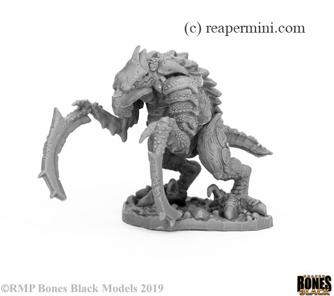
The Gloom Stalker (part of the Bones 4 – Darkreach Expnsion) ist a really cool miniature, with an interesting silhouette and a couple of different surfaces to try painting techniques, for example overlapping and flat scales, horn spikes or the smooth head or beak.
Assembly was easy (all limbs are separate) but I had to remove quite a bit of flashing/mould lines from the scything claws before the mini was ready to get painted.
I tried unusual colors (surprise!):

After a bit of pondering I settled on a red/purple combination and a reduced color palette. I was mostly inspired by the two-tone color schemes of 40k’s tyranid (which I happen to play try to play collect) and only added a bit of blue, beige and, since something seemed to be missing, yellow for the beak.
I’m still not 100% happy with the color scheme, maybe I’ll add another color to round out the palette later, but the model was definitely fun to paint and will see some use on the gaming table.
Michael seems to like purple too:

He wrote: “My painting output has unfortunately slowed to a crawl this month, but I did get my Gloom Stalker done. Because of a lot of work stress, I really wasn’t looking forward to this one, just hoping to get it done and out of the way. However, I really like the final result!
This guy was the recipient of some black spray primer. We had some gorgeous weather a few weeks ago, and I used the opportunity to spray a whole slew of models (including big ol’ Gauth) to get them ready. I decided after seeing the black to use mostly dry(ish) brushing to paint him. I say “ish” because I went very heavy with the first layer to get some color on, then built up from there, especially on the back shell. My color scheme is very Underdark with purples and gray with bone highlighting.”
Very interesting colors, pale purple and black look great together, and I get what you mean with “Underdark”, it practically screams “Drow” to me, Maybe these sinister elves are breeding hook horrors to use as attack beasts? The eyes are very piercing, yellow is a good choice there!
Timothy’s creature is camouflaged:

On the picture I spot a lot of nuanced colors, variations of beige and grey, and I like the idea that the gloom stalker’s body is black and maybe covered in stone dust making it blend in with its surroundings.
JIm’s stalker is grey too, but with some special effects:

He said: “Once again this is a mini of a creature I’ve never painted! The Hook Horror is one of my three favorite goofy monsters from the old Fiend Folio along with the Crab Man and the Dire Corbie. I love them, but they’re decidedly goofy! The Hook Horror’s description has changed many times over the editions but the original just said they are mottled gray. I decided that they would blend in with the stone and would lie in wait (with their poor eyes closed but their excellent ears alert) to ambush or run down prey. Some of the areas, especially on the underside have a purple-ish tinge while most of the upper surfaces are in neutral gray tones. I’m not sure if the little dots are just lighter colored (blue-gray) or are luminescent. If so, are they always on or just when it’s attacking?! The only color variation are the greenish eyes and I’m still debating whether I should have painted them glowing with a bit of OSL. Also, even though the pic barely shows it, I really like the way the base came out on this one. I need to clean up a few things, but overall, I like the mini and my paint work, even with the somewhat comically oversized hooks.”
Another near-monochromous colors scheme, and it works really well! I love how you picked out all the little dots – I’m firmly siding with “Team luminescent”, by the way! Imagine a group of deep gnomes or a lost adventurer wandering down a corridor and suddenly all these tiny lights light up! Creepy!
Arjen was looking forward to paint this mini:

He wrote: “This was one of my favorites from Bones 4. Maybe I tried to hard, as I am not totally content with my advanced WIP. I tried to give it a hook horror appearance without using the standard black and purple. I made some errors in execution, using very dark colors in the recesses so that the blending became difficult and less smooth. I used a toothpick to pick out all the little spots on the skin (I trick I saw someone use on Youtube), using white and soft purple, but it is very hard to spot the purple spots in the picture. Maybe I should have used it a little less subtle (less white, more purple). Also, the eye is not yet bright enough and needs at least another layer. The whole mini at this time has a very sketchy, unfinished look. Still, I think I succeeded in giving it a dark feel without using very much black or purple.”
Wow, really different and very colorful, I love it! And I think the time you invested really shows, the blending looks really good on the pictures! The colors remind me of tropical arthropods or maybe fish, did you have a specific inspiration?
And thanks for the trick with the toothpick, I saw something similar about painting eyes. A great way to make sure the dots are rounded and precisely set.
This week’s gallery:
Coming next:
07/06/20 Bones IV (Core Set) Movie night Part I: Paint Classic Horror Monsters (Sethis and Mummy Queen)
Want to participate in the next post? Email the pictures of your minis until Friday 07/03/20 to
MondayMiniature@fantasymail.de (It’s a .de domain, in case emails are bouncing)
–> Attention: The submission date for photos is about three days before publishing date, to give us a bit of time to actually write about your pictures
This way you’ll have two weeks/one weekend to paint, and we have one weekend to write (which is the only time of the week where we (might, *sigh*) have some open minutes).
You can of course send in pics later, but to take out a bit of the stress (most pics arrive here rather last minute) please consider the three day deadline. Later pics will still show up in an update
Here is the link to Reaper’s graphic with all the core pieces, but it’s one and veeeery long picture so be prepared for some scrolling. On the other hand it has separate numbers for most of the pieces. I will add individual shop links as soon as they appear!
Here is the underdark Add-on.
07/20/20 Bones IV (Core Set) Gauth, Bipedal Dragon Part One (No. 7) – WIPs, e.g. first colors, basing, modifications…

This is a big one, so we’ll stretch it over two entries!
08/03/20 Bones IV (Core Set) Gauth, Bipedal Dragon Part Two (No. 7) – Finished Monster
08/17/20 Bones IV (Core Set) Movie night Part II: Paint Classic Horror Monsters (Vampires, No. 132 and 133)
08/31/20 Bones IV (Core Set) Bedeviled: Devils/Demons (Nos. 72, 73 and/or 74 on graphic)
09/14/20 Bones IV (Core Set) Movie night Part III: Paint Classic Horror Monsters (Victor’s Creatures, No. 134 and 135)

They all came out great! And those eyes!
Antonia: very daring. I like how the light blue eye gives great contrast and makes this bird look very intense.
Mike: a very classic look, but making the claws lilac instead of yellow gives it a very original vibe. Black eye with yellow pupil: I never would have thought about that.
Timothy: this is one scary camouflaged bugger. I think I would have given the eye a different color (smoldering green?) but that might have ruined the camouflage effect. This is by far the most realistic one.
Jim: A smooth, alien look. If you said it is a bird in a spacesuit I would believe it. I like how it is black and still not boring. I love the eye.
I am curious which technique Jim used to paint the white spots: they are so much neater than mine. I used non-diluted paint and a toothpick. Maybe I should have diluted my paint?
Thanks! I see what you mean about a space creature. Ironically, black is the one color I didn’t use on this guy. The spots are painted with a very light blue/gray using (you guessed it) a toothpick. It was a round toothpick with a very small bit of the point snipped off to give a more regular surface. The paint was a bit diluted, but not very much. I hope that helps.
I would love to see all of these minis in the same place, just not as a player character! Good variation on these with some “classic” and some a bit more daring.
Antonia – Nice (and colorful)! Despite the tyranid reference and the yellow beak, I see mostly a crustacean. Maybe it lurks in an underground pool or lake. “Don’t touch the water!”
Michael – Very, very Underdark! It’s interesting to see yours with almost the same color palette as mine, yet ending up decidedly different. The contrasting color for the eye is great and really stands out.
Timothy – Yours is the most rock like, in my opinion, and would blend in very well to a rocky cave environment. You could walk right up to it and never notice until it was too late. I really like the slight brown/tan direction.
Arjen – Despite being a WIP, I like the look so far. I feel your is that most avian, even if it is a cave dwelling avian. Funny, it makes me think of tropical birds like parrots, etc. Again, a very scary, threatening parrot, but still very colorful. An excellent direction to take it in!
Mine is pretty straight forward with neutral grays on most of it and a slight purple tint on the undersides and the claws. It’s interesting that my mini looks pretty boring under low light but really livens up the brighter it gets. The eye looks a bit washed out in the pic. The color gets lighter towards the front but is almost imperceptible. I do think the contrasting green makes it show up well, though, so that’s a plus. Also, I should have taken a slightly higher angle pic as I am very pleased with the way the base came out, even if it’s noticeably different in tone than the creature. Most of the people that have seen it in person comment on the base before they say anything about the main mini! Funny!
Catching up a bit on commenting, but these all came out so well. Some are more for camouflage, some are bright and displaying (warning coloration, perhaps?), but they all look incredible. I think Arjen’s is my favorite – great work in the transitions between colors!