
Miniature Monday – Anti Paladin

Here we have a bad guy again, a darksome anti-paladin. Either a champion for the most sinister of evil entities or a fallen advocate of justice. If you want to see how our painters have visualized the squalidness of this mighty warrior, read on…
(posted by Dirk, with baby on my knees)
The most striking item on this mini was – in my eyes – the shield, so this would have been my center of attention, as I would have only a little time to paint…

My time frame to paint was one hour, carrying our sleeping child in a baby carrier at the same time. I had the idea of a righteous man ensnared by evil demons through some mighty magic items, so the shield and sword got top priority and should be linked by color, the rest was just “standard dark warrior”. I managed to make the base paint and one shading until our son woke up exactly one hour later! My wife added the light-effects later (thank you 😉 ).
Jim sent us the Anti-Paladin in shades of silver:

This is the most shining Paladin this week, and with all the blue and silver I can easily imagine this knight as either a bad or perhaps a “grumpy but righteous” good guy. Jim, did you have any specific plans with this mini or did you just use the colors you liked best?
Arjen’s evil knight seems to be in a dangerous situation:
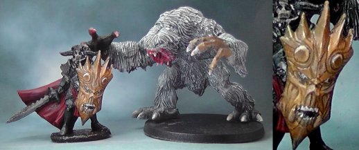
As you can see, this week’s minis shares the pic with a snow troll, which was supposed to be posted last time, but since the mail arrived a bit late we didn’t see it in baby-induced sleep deprivation. But don’t worry, you can see the troll here where it belongs!
The paladin looks great, especially the shield is an eye-catcher! It really looks like a painting! Arjen told us that he lost interest in the anti-pladin after the shield, but this is really a good work. As I already said, the shield was the best on this mini anyway 😉
William sent us a rather regal looking villain:

In my opinion he managed to give his anti-paladin the same striking appearance as his shield, a well-balanced overall look! He combined the classical red/black theme with gold, brown and bone, and the shield looks very alive!
For the base he sculpted a sigil from polymer clay and broke it into three pieces (a technique from James Wappel’s blog). So he got a natural cracked stone look and two extra bases!
Gif of the paladin here, plus a 3D-animation (William had fun with new techniques obviously) here! Enjoy 😀
Kylie’s Anti-Paladin comes in grizzly dark tones with a glow:
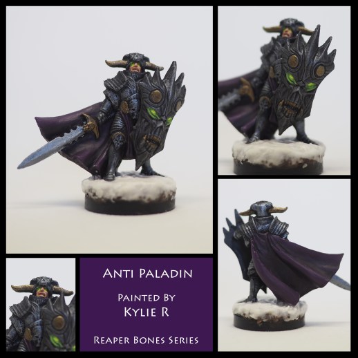
She had the idea of a paladin possessed by the shield and eventually becoming an anti-paladin, so she gave zhe mini glowing eyes matchung the ones from the shield. A very interesting idea and again a well-balanced mini! And by the way; great glow effect!
And note the presentation: the description field’s background color matches the cloth of the anti-paladin. A good example of an harmonic display 🙂
This week’s gallery:


Coming next:
03/27/17 Burrowing Horror Vers. 2 (aka Bulette/Land Shark) Core Set

04/10/17 Dwarf Cleric (aka Father Christmas/Dwarven Santa  okay, I’m kidding here) Core Set
04/24/17 Tick Queen, Core Set
05/08/17 Sqoug Warriors (Swamp Invasion Part I) Core Set
05/22/17 Imrijka, Iconic Inquisitor (Female Orc Inquisitor) Core Set
05/05/17 Kelpies (Sea “Elves”) Core Set

I am always so surprised by the variety of everyone’s paint schemes. They all look so different and yet they are all really awesome.
Dirk – I am really impressed that you did that in an hour. I have a painting competition coming up where we all have 6 hours to paint a model and I am worried it wont be enough time! I was surprised that I was not the only one who saw him as possessed. I suppose its cause the shield looks so evil on its own!
Jim – Great Job. I agree with Dirk that the way you painted him really leaves a lot of room for interpretation. That is really useful if you plan to use the model for RPGs. Was that your aim?
Arjen – by painting the shield a different colour you really help it stand out – which it deserves, it really is the centerpiece of the whole model. Also, very cool troll/yeti!
William – Really impressive job. There are a lot of details that I really love and they all come together to make a really cohesive model. Also very nice idea of breaking the sigil to make 3 bases!
Thanks, Kylie! Honestly, I was just thinking of him as a villain, but now that you and Dirk point it out, he really could be anything I want. Isn’t that what RPGs and fantasy are all about? I like to misdirect my players whenever possible, so this might be the perfect opportunity.
Wow! I really missed the boat with glowing eyes and such! I fully expect the shield on everyone’s mini (except mine) to start speaking in a deep ominous voice.
Dirk – I, too, am impressed by the quickie paint job. That’s pretty good stuff! I also love the backstory. A possesed good guy works well.
Arjen – I love the way your shield jumps out and seems to have a life of it’s own. Very cool contrast to the body & cloak.
William – The red & gold scheme looks great. The shield is yet another scarily “life”-like example. Kudos on the base, that really helps lift this mini above just being a bones cheapo!
Kylie – More glowing eyes! All kidding aside, great paint job and I love your version of the possesed story line. Sometimes it helps with painting to make up a story, background or even a name for the mini.
As far as color choice is concerned, my only goal was to try to avoid the standard “evil” colors of black & red/purple/green. So of course I chose a dirty, mustard yellow! I didn’t like it but I thought midnight blue would look cool. I now see this guy in a whole new light!
I don’t know how we could have avoided some element of black on this one. I primed mine in black and originally thought I would just do a heavy drybrush to bring out the armor and shield detail. That didn’t really work on the body, which had to be re-worked, but the technique is largely intact on the shield. I may still go back and do more. I intended the sword to be the element that stood out most. I imagine a party of brave adventurers encountering this warrior and thinking “Oh, crap! Look at that sword! We may be in over our heads!”
Thanks for your kind words! It was the first mini in a long time, and it is not so detailed as Kylies or Williams, but I am happy with the result considering the time I had. It was really good to paint again, and I will try to get and hour or so every other day or so.
Dirk
I’m pretty pro-paladin myself – always play them in RPGs, so I would fight the shit out of this guy (the model, not the writer – you’re great don’t worry). Sweet model, and that snow troll is pretty badass too.
Nice work, everyone! I especially like the glow effect that Kylie and Dirk and Antonia achieved.
Did anyone succeed on viewing the 3D picture? You’re supposed to cross your eyes so that your left eye sees the right image and your right eye sees the left image. It’s a little tricky, but I think the effect is cool.
Now I get it! I thought I needed 3-D glasses. Once I got my eyes to focus correctly, it worked great. That IS pretty cool!