
Miniture Monday – Bregan, Valkyrie
Riding the cold winds from the North, a legendary warrior comes to caffeineforge this week: Come and see our painter’s takes on the valkyrie!
(posting by Antonia)
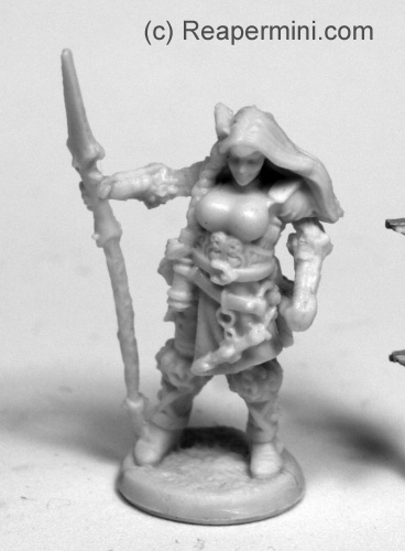
First, some thoughts about the mini. My version had a slightly bent spear which needed a hot bath, and fortunately next to no mould lines. Only the left hand could have more detail, and on Dirk’s version it was kind of “melted” into the sword handle, i.e. hardly distinguishable from it. As painting subject, I liked the Valkyrie miniature a lot, it has great amount of detail and some open areas for freehand painting, and although the gear and clothing are probably not historically accurate, they do give an awesome “northern” oder viking era vibe with all the furs, wrapped boots and ring elements on the belt.
But, unfortunately, there is something I really don’t like – the comically smooth and oversized breasts (or very very massive “boob-armour”?) and, to some extend, the pose/arched back. As a large-breasted person (if I may say so) who is also LARPing* I’m really wondering what made the designers** decide that would be a practical or just somehow believable choice in bust size… Yes, Valkyries are mythological beings and not “real”, but they are creatures of the battlefield, and not exactly fertility spirits or something like that. Maybe they wanted to balance the relatively broad shoulders (which I do like a lot for a warrior type character!) and went a bit overboard?
Anyway, since Bonesium is easy to work with, that’s something which is comparatively easy to fix, I suppose.
I painted her “historically realistic”… ish :p

For my color scheme I chose rather muted colors like blueish gray (supposed to be woad dyed, although it seems bluer on the pictures) and matte browns, because I wanted a bit less of the “High Fantasy” feeling that I get when I use brighter colors, a lot of red etc. (The Army Painter color range itself seems to be a bit cooler and muted in general, as opposed to Citadel Colors or P3, for example. Which brand of colors do you prefer, dear readers? Is there any specific one?)
As I disliked her bust size (see above) I used an crafts knife to reduce it to something like a DD or E cup. I didn’t have sanding materials at hand but fortunately the cutting marks work fine as creases in cloth, so I painted the whole front piece as some kind of tunic.
The hair color is a bit of an experiment, since I wanted her blonde, but not the “golden yellow” elven variety but more of an ashen tone, so I used some color called “ginger cookie” to get a more sandy blonde.
For the spear blade I also used a mix of normal silver and dark grey to give the impression of cold iron – my valkyrie is probably out to kill some faeries.
Dirk painted the mini to be scottish!
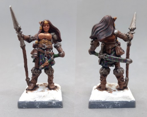
To explain why he decided to paint a viking-era mini donned in tartan (Sutherland tartan, to be specific) you have to know that we have family in northern Scotland (not related by blood but still family, it’s a bit complicated) descending from the Sutherland clan. They say the Sutherland clan got its name from vikings who arrived at the northern tip of Scotland and called it “southern land” because from their perspective, it was! So this mini was painted as an homage to that situation (or rather legend) and is supposed to look a bit like my sister-in-law 😀
About the paintjob – I absolutely love it! It’s still a bit of an WIP, for example the eyes need to be painted and Dirk will undoubtedly fuss over some details, but the tartan looks awesome already (and it was a wise choice to leave the rest relatively plain so the detailwork on the cloth can shine!). From now on I’ll find excuses for PC and NPC minis to be clad in tartan, and Dirk has to paint all of them 😀
Michael gave his Valkyrie some hellish heritage:

He wrote: “Months ago, when I was organizing the models after receiving them, I saw the horn/wing/projection on the side of her head and instantly thought “it’s a tiefling”. After she went on the to-do list, it actually took me a little while to find it to paint because I was looking in the bag with human heroes!
Even now knowing what it was supposed to be, I decided to go with my original thought and make her a one-horned tiefling. I used a golden yellow and some blues on her clothes, armor, and weapons to keep with a somewhat valkyrie theme. I’m thinking she’s one of those tieflings who is trying very hard to rise above her diabolic heritage.”
As a fan of tieflings, I think it’s a very cool take on that mini! The bright colors and the unnatural hair and eyes make her look like a completely different model, which is one of the reasons I like this whole blog so much – so many versions and ideas, a great inspiration for everyone! When you say tiefling, which setting do you think of, Michael? Eberron in the lates installment of D&D? I play a tiefling in one of our (many) groups, in 3.5 Forgotten Realms. He is a rogue/bard (don’t ask…!) with deep red skin, sharp teeth and small horns, like the middle brother of Hellboy and Nightcrawler, I suppose *laughs*
Arjens Valkyrie reminds me of snowy skies:
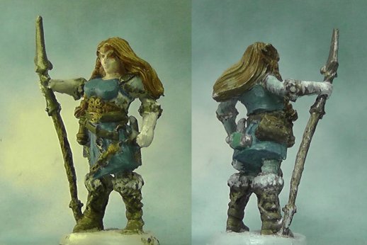
Like me, Arjen was not too happy with some anatomic details. He said “I loved the concept art for this miniature. I was shocked when I saw the first digital render. Something went really wrong in the head of the sculptor (there is a story about how they wanted the Nazgul’s flail in LOTR part 3 to be huge and after every test run they said “nah, bigger” and it increased until it is now the size of a shipping container…maybe something similar happened here?). Anyway, I took a knife and I am rather pleased with what I made of her bosom. I also added a bit of greenstuff to her extremely curved back, so it now looks more natural”
I also thought about doing something with the curved back, but due to lack of time I only worked on the front parts (bits?)*** but I’m glad you found a way to even out her pose a bit!
For colors you used a lot of blue and white, which made me think of glaciers or snow-filled skies – absolutely fitting for the theme! You said the model was a nearly-done WIP with the eyes still missing (like with Dirk’s one, the eyes are always a bit tricky) – will you give her blue eyes? Or grey, perhaps?
Jim painted the model like it asked to be painted:
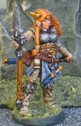
Jim wrote that “This is one mini that told me exactly which colors to use: Red hair, blue eyes, etc. I hope she came out somewhere between real-world Viking shield-maiden and other-worldly Valkyrie.”
The red hair is a great idea and works surprisingly well with the golden belt/belly-plate where you – again – seem to be much more able to bring out the details, mine just looks like an ornamented mess. It also builds a nice contrast with the blues of scabbards and cloth. It looks like you (or Bregan’s voice in your head?) used a slightly reduced color palette with great success to make face and hair the focal point of the mini, balanced, but not overwhelmed by the golden ornament. Well done (whoever)!
———————
*even a viking era PC, although that doesn’t matter cup-wise, I guess
** the sculptors, that is, because the concept art was lovely, thanks Izzy 😉
*** Funny to see that of all people two Europeans got irritated by the bust size, and none of our American painters, although American media seem to be much more sensitive about areas or topics like these. I don’t mind big breasts, by the way, or even some cheesecake here and there, but this cup size just seems… unreal? After I noticed that her boobs are about twice the size of her head, I somehow couldn’t unsee it again *laugh*
And did you notice? Mini Monday came out on a Monday!! After weeks of being late we made it this time 😉
Here is this week’s gallery!


Coming next:
10/15/18 Bones II The Horned Hunter (B2 Core)
(I added some of your suggestions already, I might shuffle them around a bit, but keep them coming! For some minis there are no pics in the online shop yet so I’ll add them later.
10/29/18 Bones III Hobageddon: Hobgoblin warriors (B3 Core)
11/12/18 Bones III Elven Blacksmith (B3 Core)
11/26/18 Bones II Bat Demon (B2 Core)
12/10/18 Bones III Blood Hoof, Minotaur (B3 Core)
12/24/18 Christmas break
12/31/18 New Year’s break
01/07/19 Bones III Christina, Female Cleric (B3 Core)
01/21/19 Bones II Cuth Wolfson, Barbarian (B2 Core)
02/04/19 Bones III Wild West of Oz Wicked Witch plus Monkey* (B3 Core)
*they sell them in packs of three (obviously) but in the KS there was only one piece
02/18/19 Bones II Dub Bullock, Rogue (B2 Core)

I very much like Dirk’s version. Smart to keep the rest of the mini in demure brown colors, so the tartan skirt gets most of the attention. Except for the bronze boobs, they distract from the skirt and personally I do not like the color. I have a similar color in my paint collection (GW Dwarf Bronze) and I tend to mix it with other colors as it is just too shiny: bronze only has that color if it was polished last week (or if it is red gold rather than bronze). Mixing in some brown gives it an aged patina that fits more with a daily use bronze object.
Antonia chose more or less the same color scheme as me and yet her mini has a warm radiance whereas mine is arctic: it is nice to see how a slight change in the hues (her choosing reddish brown rather than my greyish/greenish brown) gives such a subtle yet distinct difference. On the other end of the spectrum there is Mike, who boldly turns the mini into something completely different. Excellent job. The only pity is you seem to have lost some of the detail in the belt. What did you do, black with a white drybrush? Does anyone has a tip for this, because, frankly, I have the same problem: how do you best highlight black objects with fine details?
JIm beat us all in brushwork: subtle highlights in the skirt, picking out all the details: well done.
Highlighting black objects is in my opinion harder than it looks. Therefore I prefer to paint dark grey instead as you can shade it with black wash.
The simple way is to highlight with grey, but you can also highlight with brown or blue to give the black a more warm or cold feeling.
Pint the areas that will catch the most light, i.e. edges or a light spot on round surfaces.
How bright you do the highlight depends on the surface structure. Matte surfaces such as leather should get darker colours while glossy or polished surfaces have a stronger contrast on the light spots. You can use lighter highlight colors and make fewer colour gradients between the black and the highlight color, you can even make a final highlight with white as a small light spot.
If some of our readers have examples of highlighted black areas on some minis, you can send us pictures and we’ll prepare a special painting post about highlighting black!
Yours, Dirk
I freehanded white (I don’t think it was pure white, but I can’t remember) as a highlight on those belts and straps. I think I probably should have gone back and cleaned it up a bit so that there was just an edge showing, or, as Dirk suggested, used some gray instead. On this particular model, I will admit I got a little lazy at the end and said “Good enough!” so I could move on from it.
I’ve also done the dark gray + black wash technique. I’ve also highlighted black with blue and purple for an interesting effect. If you look at comic art of Superman, for example, his hair is often highlighted with light blue.
First, thanks for the compliment! Black can be difficult to work with for sure. I highlight black with gray but don’t usually get too light, except for maybe a single spot or two like Antonia mentioned. You can definitely change the look by using different tones as highlights: Gray, blue, brown, etc. I remember the Ape Demon that I started with plain black but highlighted with gray on the fur and brown on the belly and wings. There are other examples that we’ve done for MM, too. I like to start by mixing a little of the highlight tone in with the black and gradually work up from there.
Antonia – Great color choices! She looks very “realistic” (for a valkyrie). I was a bit disconcerted over the large breast size, too, but what bothered me even more was a Viking with plate armor! I think that was a good call giving her breast reduction surgery and changing the armor to cloth.
Dirk – I’m jealous of the tartan, both the idea and the execution! My own Scottish relatives may disown me for not thinking of it. She looks great.
Michael – Cool tiefling idea! The colors really support the theme. She looks diabolical.
Arjen – Ours are almost twins! She looks very icy and even a bit supernatural. It seems as though blue was a common thread in all the minis this time.
Mine didn’t exactly ask, she demanded! Actually, just before starting her, I encountered two women/girls who gave me the general idea: The PA I see regularly has red (more coppery) hair, blue eyes and is actually from Sweden and my niece’s friend’s cousin who has pale red hair, blue eyes and also has Scandinavian blood. It seemed the only choice! I read somewhere that this is the rarest hair/eye color combination as well. In any case, I generally like the mini because she’s dressed fairly appropriately and looks like she could truly swing a sword. Nothing against slightly built women in chainmail bikinis, but Bregan is a nice change of pace.
Antonia mentioned paint preference somewhere and I have to say I don’t really have a preference though I’m starting to replace old colors with Reaper paints because they’re so easy to get ahold of. Almost any brand is good quality these days, so you almost can’t go wrong. I will admit to being a bit fond of P3 both for colors and quality.
Most of my paint collection is by Reaper. I got into painting through the first Bones Kickstarter, and my first paints were the sets they offered for a discount on that KS. I continue to order the paints from the Kickstarters and I’ve bought a bunch from my local game store and from their website. They’ve got a huge range of colors, and the consistency is usually perfect with only a little bit of shaking needed. Beyond those, I collected a few Vallejo but a bunch of Army Painter. I stayed away from Citadel and P3 because I like dropper bottles, especially because then I can measure drops when mixing. Only recently have I gotten a few items from Citadel, and they’re basically all technical paints with textural components or washes.
Some of my favorite paints are from Army Painter, including Gun Metal metallic and Soft Tone shade. However, I’ve noticed the consistency in the AP paints is sometimes kind of thick and sometimes too liquid, as if the pigment isn’t fully blending into the medium, despite my efforts to shake the bottle (my Daemonic Yellow, Hydra Turquoise, and Fire Lizard get this way). I really like the colors, though, so I do my best.