Miniature Monday – Aglanda, Herald of Razmir

At first sight rather plain, this robed mini inspired a lot of different versions! Read on for space cultists, druids and more!
(posting by Antonia Dirk two busy parents)
Note: We had everything ready. The minis were painted, photos taken and uploaded, all we had to do was write the article. Then our little one went on sleeping strike (the time he saved on sleeping went into screaming. A lot.) and we spent the whole evening as baby fire brigade. So it’s tuesday again…
From the first look, this is just another robed figure. Here is what some of our painters thought of it:
“It is like the Anirion mini, that if you just paint it, it may become boring; you have to add something to it.”
“I thought it was a little ho-hum when I first saw it on the schedule, but I really got into it.”
So let’s see what we got this time…
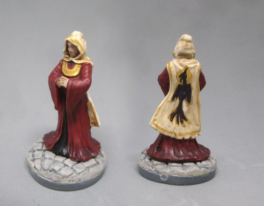
Antonia went for a royal outfit:

Antonia said: “I thought about using the mini as some aristocrat or noble, preferably in gothic sci-fi like the 40k RPGs, but also maybe as NPC in a fantasy campaign, so I used no definite sci fi elements like a gridded or technical floor. The combination of red and gold always looks like expensive cloth to me, so I chose that and creamy ivory as the second cloth tone. I wanted to paint a detailed crest on the back of the cape, but then I found that the gold paint was way to pasty and didn’t allow for details, so I settled for a rather rough, medieval style intead. Still worked out fine, I’d say. The color gradient – light to dark red on the bottom – isn’t visible on the picture, but to be honest, it’s very faint on the original too. Overall I liked painting the mini, it left room for patterns and markings.”
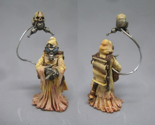
I had no idea how to use this mini as it was, so I made some little modifications: (understatement of the year – Antonia)

I used some parts from my bits box to give her a science fiction feeling. For this mini I tried to paint it “blanchitsu-style” (if you don’t know it, John Blanche is an artist working for Games Workshop with his own unique style), so I used a lot of washes on a white base colour, adding colour with the washes (ok, I also used silver and brown). It’s almost like painting with aquarell. The mini is still a work-in-progress, and some of the washes were still wet when we took the photos, but I like the results so far.
Arjen got his inspiration from the Reaper catalog:

Arjen’s Herald is dark and gloomy, like the “official” version on the Reaper page, and when we googled the name of the mini, a lot of dark robed and cultist-style minis turned up, so it seems a lot of people thought of Anglanda as a dark figure. It’s great that we have so many different versions though! On this mini I like the mask on the face with the cat-like eyes, and the pattern on the sleeves is a nice eye-catcher too! Arjen, did you find it difficult to paint a mostly black mini? I’ve heard many people complain about the highlighting/shadowing with black, that’s why I ask.
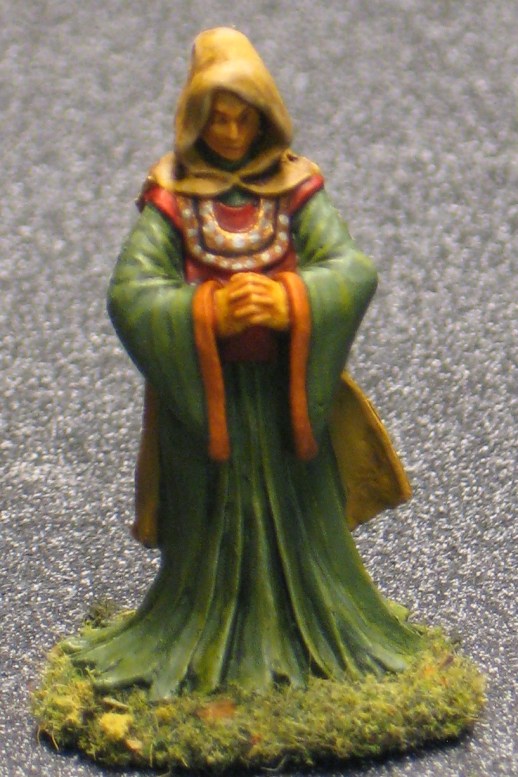
Jim’s herald was all autumn-influenced:

Jim got the idea for this druid-version of the mini while taking a walk among autumn leaves. He tried to get the whole spectrum of green, yellow, orange and red colors onto the mini, so like many artists he was inspired by nature. I like the contrast of the orange sleeves and the green robes, the bronze element fits well into the color scheme. Nice idea with the dots, by the way, it’s always a good thought to give smooth surfaces some kind of pattern.
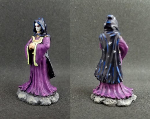
Michael’s version is definitely “spacey”!

After seeing the all-too serene, smooth face Michael decided that it wasn’t a face at all, but a mere mask! He chose a purple and bright green color scheme, which is definitely special! He wrote he wanted to achieve a kind of creepy “space cultist” look, and I’d say it worked. The mask is a great idea, just by painting it white we are made to wonder what could be under it? Something scary, I’d say! The dark blue cloak with the “outer space” look fits greatly with the whole theme. Thumbs up!
this week’s gallery:
Coming next:
11/06/17 Bones II Strange Monsters: Mind Eater and/or Chthon (B2 Core)
11/20/17 Bones III Vagorg, Half Orc Sorcerer (B3 Core)
12/04/17 Bones III Death Dog (B3 Core)
12/18/17 Bones II Friar Stone, Monk (B2 Core)
01/01/18 New Year’s Break (Really! But you can prepare for the next minis while sobering up, of course 😀 )
01/08/2018 Bones III Dashing through the snow: Yetis (Shaman, Warrior, Shredder, as many as you like!) (B3 Core)
01/22/2018 Bones III Aeris, Female Elf Ranger (B3 Core)
02/05/2018 Bones II Infernal attack: Fly demon and/or Blood Demon (B2 Core)
02/19/2018 Bones III Giant Cobra (B3 Core)
03/05/2018 Bones III Lendil Blackroot, Wizard (B3 Core)
03/19/2018 Bones II TBA
04/02/2018 Bones III TBA


Regarding painting with black: I took very dark grey as the base color, so I could make shadowy recesses of the inside hood and area below the hands by using real black. Also, it is easier to highlight from dark grey to slightly lighter grey, it will look more natural. This weekend I went to my first mini painting class ever and someone there suggested mixing a bit of dark blue into your black to obtain something that looks blacker than black. I will try it out some day, but the idea came too late to use on this mini. Michael seems to be doing something similar to that with his cloak.
I like Jim’s autumn color scheme except for the face: there should be some contrast with the hood in my opinion. The copper spotted necklace has a certain snake-like quality that works very well and enhances the druid outlook.
I love both space versions.
The blue eyes make the drab yellow figure interesting, a good call, Dirk. The mod looks very smooth and convincing.
The masked mystic with the starry cloak remind me of an obscure comic character called Darklon the Mystic (he has dark clothes full of stars and and lives in a dark and unforgiving universe). There is something alien and lonely about Michael’s version of this mini that I like.
I agree. The skin tone on mine was a little too brown for my taste and it’s most noticeable on the face.
Interestingly, the color on the cloak is pure Vallejo Night Blue, with the highlights being a touch of the Night Blue mixed into Reaper Blue Flame. I didn’t do any shading or anything, just the few highlights (and then the stars). The Night Blue paint has this almost oily gloss to it. I don’t know much about the composition (the few Vallejo paints I have all seem different in texture than my others, which are Reaper and Army Painter), but it looks so different than usual paints, so I use it sparingly. This time, the point was to make it otherworldly, so it worked.
No two alike! Some interesting takes on this one.
Antonia – Great color scheme (red/black/white) and I like the artwork on the otherwise plain cloak.
Dirk – Looking very “bug-ish”! It’s shaping up nicely.
Arjen – I was surprised that this is what the official version looks like. I never would have opted for that on my own! Very sinister.
Michael – I think I like your color choices best. The starry cloak looks great!
Mine is a case of the idea being better than the actual result. That’s how we learn, right?! I probably should have used one less color for a little better unity, but I’m still pleased with the mini. I still can’t quite decide whether it’s a male or a female, though.
I’m basically going to second all of Jim’s comments here. Since I started submitting here, this model is probably the most varied in terms of overall concepts, which is actually saying something! Thanks to whoever picked this!
I also like the diversity of the entries this time. As I saw this mini the first time, I thought it is some kind of holy figure (I even imagined a halo), but I had no idea what to do with it… as a dark roped figure I like her (I think it is a she, but Jim’s right, it could be used as a male either) very much.
If I would get her another time, I would try the black ropes too.
Dirk