
Miniature Monday – Mystic Theurge
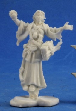
This week’s miniature is so mystic, it floats! And we have a great range of colors, styles and ideas to show, read on!
Again it’s more a Miniature Tuesday than a Monday, but anyway, we’ve got quite a range of minis this week!
I was suprised about “density” of detail, there were layers over layers. A nice thing for painters in general, only annoying if you don’t have too much time on your hand, like us 😉 But since we decided to cover as many of the details as possible, we ran late. Even if the baby hadn’t run rampage in the flat…
Dirk took the floating aspect as an inspiration:
Dirk painted this mini as an air wizard because of the floating pose – he plans to paint wizards for every element, which I think is a cool idea! For air, he used mostly white and light blue, but also yellow to distinguish the color scheme from a water wizard. He plans to do a lot of drybrushing to make the whole mini more pale and “cloudy”.
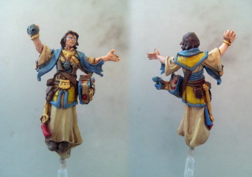
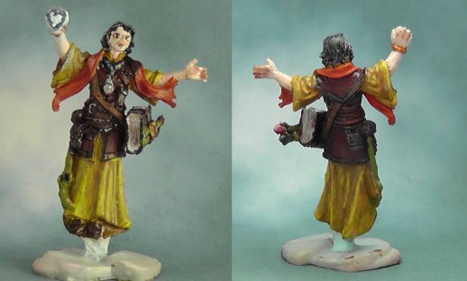
I did a lot of conversion work:
The floating pose and the robes reminded me of illustrations of Games Workshops 40k books, so I decided to paint the theurge as an “astropath”, blind, psychic seers who are capable of interstellar telepathy. Of course for that I needed a lot of grimdark gothic bits, like skulls and chains, which I found on Warhammer Fantasy Battle (aka Age of Sigmar) sprues of Flagellants.
I gave him a deck of cards which are used to divine the future; for that I cut tiny rectangles from plastic sheet and glued them together – I can’t tell how many time those pesky things sticked to my fingers instead of each other!! But still I like the result a lot.
For the floating I used pieces of clear plastic (e.g. from a PET bottle) as a stand and covered them with wood glue. That dried semi-transparent, which is okay for this kind of “telekinetic force”.
Overall, I’m really proud of the mini, it was a lot of tedious work but worked out really well! On the plus side, since astropaths are blind, I didn’t have to paint eyes this time, yay! 😉
Michael sent us a white, blue and gold theurge:
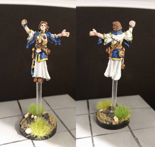
Michael said he “went with much brighter colors than last time. I found it to be a little tricky doing highlights and shading with white; I started with a light gray, then linen, and blended up to bright white on the highlights. The blue and gold was inspired by my old high school colors. I replaced that little piece of plastic with an actual flight peg to give him some height. And then – for the first time ever – I did up the base. I expect I’ll be doing more of that, considering the quantity of material I had to buy… :-)”
Nice work with the base! I like the combination of flying base peg and structured base, esp. the grass tufts. Which manufacturer are they?
The striping of the seams is a great idea! It looks very medieval and is a nice touch which I’ll keep in mind for future use 🙂
Arjen’s theurge is colored in a bright yellow:
Arjen wrote he invested some time in this mini, which shows! He was not too happy with the eyes (although I think they look at least okay) because he says his hands are not steady enough – something I can absolutely relate to. Although I avoided the problem this time (see above) I have had some good results with a very fine pen to put in the pupil. Maybe something to try?
He wrote “I chose to make him one of those rare arcane spellcasters who can wear light armor, which is different from the original illustration in the pathfinder book that this one is based on” – great idea! The upper part of the robes can double as armour if painted in brown! That’s what I love about this project, always some new ideas and perspectives.
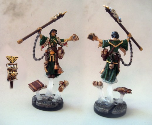
Brian’s theurge sports an intense blue:
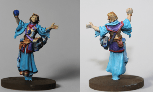
He wrote that he painted this WIP in between baby and work (story of our life, at the moment!) and tried xenithal highlighting – that’s the one where the light comes from above, right? I like the rich colors and could imagine this one as a magician/priest of water. Did you chise the colors on purpose or simply because you liked them?
(Brian also had some troubles with the eyes. maybe we can collect some information or even to an article about that. Does anyone has some tips to contribute?)
Jim also chose yellow/orange, just a bit more muted:
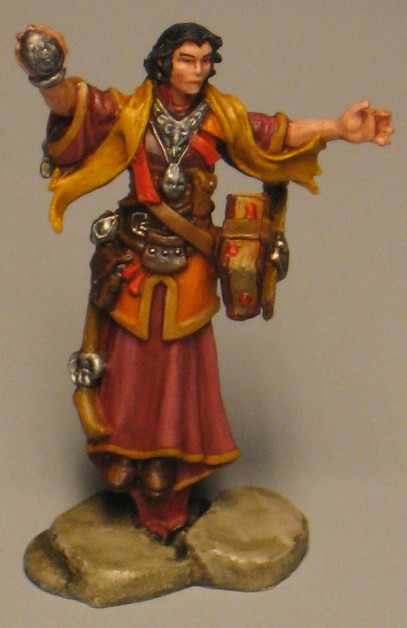
Great work on this one, Jim! I think you did best on all the details, your version is the first where I see this talisman-thingy in his sleeve. Kudos for finding that, do you use a magnifying lense or do you just have very sharp sight? Nice choice of colors, they work well together. And you even gave him eyebrows! He somehow reminds me of Benedict Cumberpatch as Dr. Strange 😀
This week’s gallery:


Coming next:
07/31/17 Gauntfield (Grim Reaper Scarecrow), Core Set
08/14/17 Olivia, Female Cleric, Core Set
8/28/17 Swamp Invasion Part 2: Turtle Warriors, Core Set
9/11/17 Little ones: Hobbit Ranger and/or Gnome Druid (as many as you like 🙂 )
9/25/17 Catch-Up Monday: Monday Minis that you missed last time! Bones I & II
10/02/17 Start with Bones III! Mini is still to be announced 🙂
10/09/17 Bones III miniature TBA
10/16/17 Bones –> II <– miniatue TBA

These are great! I love all the different colors. It’s interesting because while Dirk was going for an air wizard, it does look like Arjen’s could be for earth, Brian’s for water and Jim’s for fire. The whole set of elements!
Dirk, I like the white/cloth color with the brown shading. That looks great, and is definitely a combination I’d like to try in the future.
Antonia, I’m blown away by all the modifications and the paintwork, especially on the scarf, banner, and cards. It looks incredible. I also like the transparent flight pegs you made.
The armor on Arjen’s is a great idea. Lightly armored spellcaster minis are in short supply, so kudos on seizing the opportunity.
Brian’s lighting looks great, especially on the sleeves. I also like the golden chest piece he’s got on.
Jim, your blending on the shades and highlights is super smooth. It looks amazing.
So, I realized I made a huge mistake on mine – I completely missed the extra piece with the book and rods. I know I still have it somewhere, but I didn’t realize it belonged to this mini. Whoops. When painting it, I was thinking to myself, “What the heck is this little nub on his hip supposed to be, anyway?” I’ll have to fix it and send in an updated picture. I think I was focused on my plans for the base! The turf and talus are from Woodland Scenics, but the grass tufts are by SceneMaster. I went a little nuts at the hobby shop buying these and the liquid cement spray, so I’ll probably try to use these on lots of pieces moving forward.
With regards to eyes, I’ve always tried to brush on. I use black first, covering in the whole area, then try to make little white spits on either corner. If I had super steady hands (which I do not), it’d theoretically make a white eye, with a pupil and a light outline. I generally go a bit far and have to reapply flesh tone to the cheeks, nose, and/or forehead. I have to admit, though, a pen is sounding pretty good!
I love Dirk’s color scheme and wow, Jim has very nice details everywhere and a little rim on the skirt.
Nice work, everyone, and I’m glad to see so many versions!
Dirk: I like the blue & yellow scheme especially with the off-white robes.
Antonia: Again with the mods! Nice color choice and I love the cards, but what I’m really jealous of are the runes on the scarf. I was toying with the idea of stars, comets, moons, etc. on a dark background but it didn’t seem to fit my color choice.
Michael: Blue/yellow/white works well and the edges came out nice. I think the non-book area looks fine and the base works really well. Looks like he’s about to let someone really have it!
Arjen: Similar color scheme to mine and I think it works. I like the idea of the light armor as well.
Brian: I’ve used that purple & blue with a dash of red scheme on wizards as well and it looks very magical.
My mini is named Roy. That’s short for red/orange/yellow! I started out thinking this one was too busy for my taste but the detail on mine was so crisp and sharp that I had to keep reminding myself that this was not a metal mini. I love the Benedict Cumberbatch reference. Maybe he speaks in that voice? I had to give him eyebrows because he looked slightly odd without them. I did the eyes with a brush and the brows with my trusty pen. Oh, and yes, I do use an Opti-visor. I still can’t figure out what the thing hanging from his right hip is though.
Excellent works all around. I love seeing different takes on the same miniature.
Dirk’s version really draws me to the eyes. A very cool effect that works well with a powerful air elementalist.
You version convinces with the addition of playing cards and the floating scrolls on the base. Really adds to the sculpt.
Michael’s trims remind me of Byzantine / Late Roman styles, so that gives it a more historical feel.
Arjen’s version as a nice colour play going for it. I think the reds and straw yellows work very well together.
Brian does the same with blue. A good selection of shades that really make the mini pop.
Jim’s contribution impressed me with the face. With subtle highlights he achieved a striking expression. Picking out the talisman was also a good idea and further adds to the mini.
Overall beautiful pieces of art and I look forward to reading more of these collaborative posts (I am catching up on WordPress right now, so will go through stuff in the next weeks).