
Monday Miniatures: Oxidation Beast
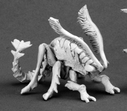
This week we tackle one of the uglier (in my opinion) minis of the collection. The rust, I mean – oxidation beast, is a creepy little bugger. I actually wasn’t sure what to expect, but it paints up rather nicely, as you will see if you look below.
Demigods Rising – The game itself has no appeal, but the sculpts are lovely to look at.

I enjoyed this guy, but I think that is mostly because I have really enjoyed working on weathering effects lately. They definitely came in handy. Like most, I went with a rust theme.
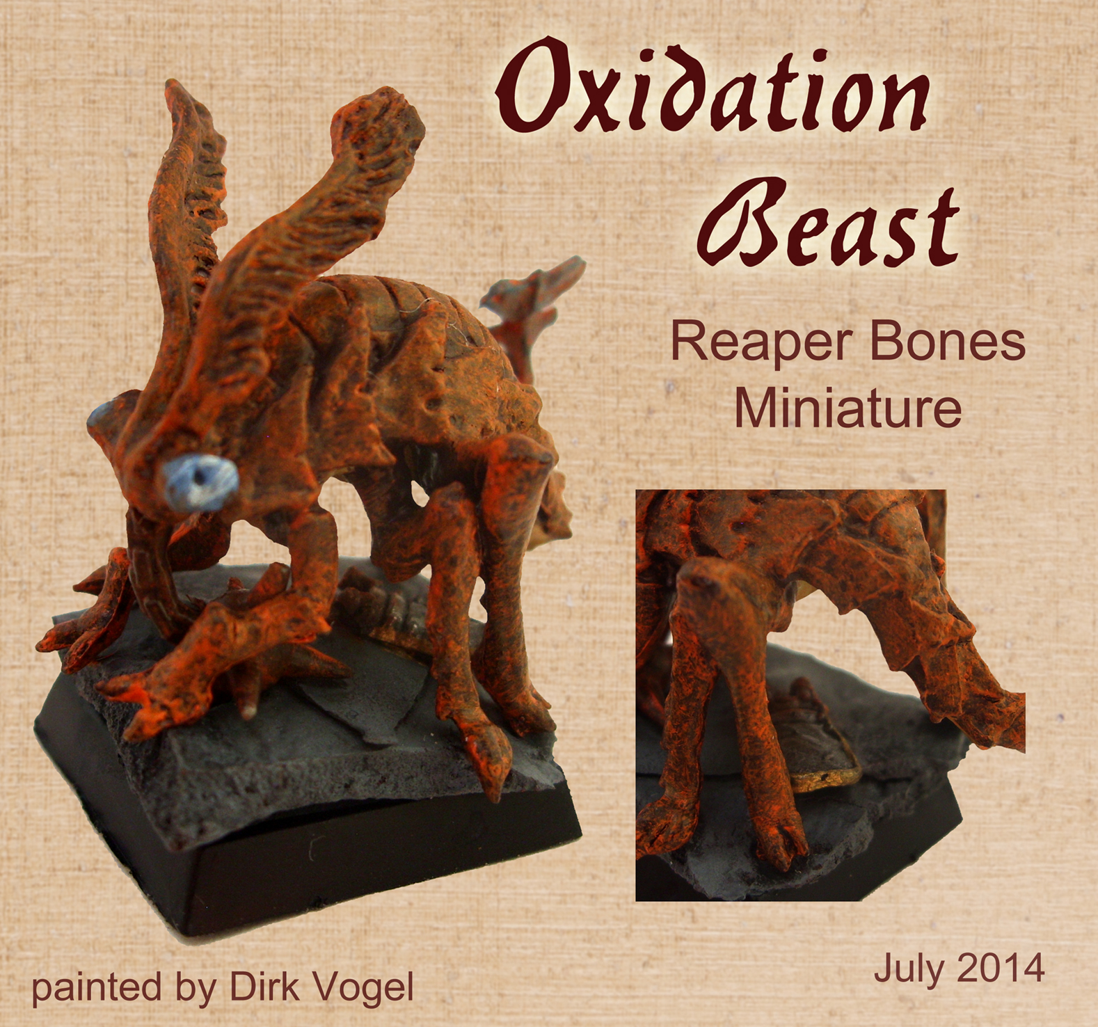
Dirk went for a similar if slightly higher contrast color scheme. Notice how much smoother this oxidation beast is; I swear by GW’s textured paints for work like this.

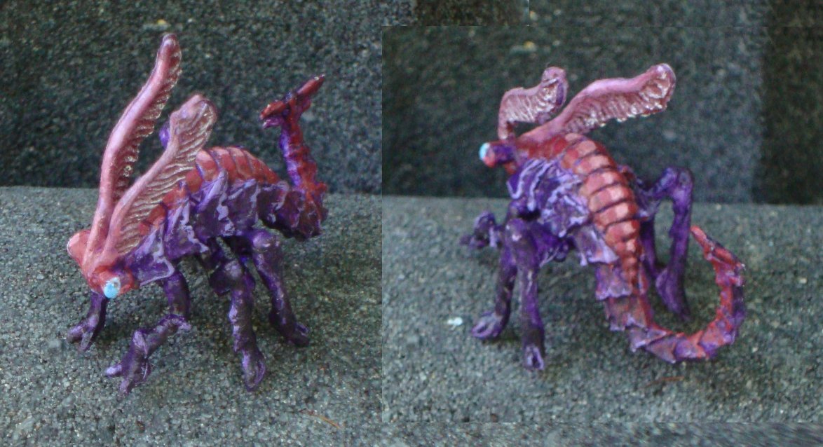
Kylie gets my vote for favorite paint job this week. This one looks less mundane, and more malignant with it’s verdigris highlights.
Arjen decided that the traditional color scheme was rather dull. To quote him, “As a rust monster it sucks, but if you paint it as some super insect I like it a lot!” I couldn’t agree more, and I love how vivid it came out. Great work!
Update:
Magnus gets his mini in in the early am. I like this compute scheme. It’s simple, clean, and reasonably traditional.

Goblins – Week 1, WIP shots Please send pictures to Caffeineforge@gmail.com by 2100 MDT on 8/10/14
Goblins – Week 2, Finishing the Horde
I got a bunch of great suggestions on minis last week. If you want to see something specific on the list, leave a comment.

I do not know what I like best about Kylie’ s rust monster: the glowing eyes and sort of glowing body, or the fact that the greenish blue is the colour you get when certain alloys of copper are rusted. Excellent work. Though I admit David’s rust is the most realistic.
Wow, everyone achieved some really awesome results this week! I’m surprised at the variety, too.
Really astonishing and divers work! I painted my oxidation beast in traditional colours (in a rush as I needed it 2 hours later in a D&D game), but love the result.
@David: I begin to like the GW rust effect, looks really crumbling!
My favourites are Kylie´s paint sheme (awesome) and Magnus´s (the most realistic), but I like all of them.
First I was anoyed about the hole in the I (didn´t had the time to fill it; saw it too late), but others seem to have the same difficulties, so am not worried anymore.
Now we are off on a short vacation to scotland, but our next fotos are already on their way. See you all for the goblin final!
I enjoyed the blog post. Some fun paints and bases! Always neat to see the different interpretations. Why are we calling it an Oxidation Beast though – is that Pathfinder’s name for it? Unfortunately, I can’t see the painted one at the top very well. The page formatting is not displaying correctly for some reason (the blog info is sitting on top of the picture – in my version of Firefox at least). Anyway, thanks for sharing! Keep up the great work all! (btw, just checked on Chrome and it displays fine there).
@cosmothea: Reaper named it an “Oxidation Beast”; I can only assume that “Rust Monster” has a copyright or something.
I love what everyone did – I love seeing how different each one is…
@David – I love the weathering effects, they add great texture to the model.
@Dirk – I think the speckling gives that real rusty look. I tried with mine but it was too subtle. BTW Enjoy your holidays!
@Arjen – I love the colours and alien bug feel. Looks awesome.
@Magnus – The shading on yours is really amazing! I think the colours look really realistic too.
Thanks for the compliments guys – I am glad it was obvious I was going for a rust with verdigris (copper rust) highlights. I was a bit worried it would look a little crazy if people didnt make the connection.