The Wardenclyffe Horror – Font Poll
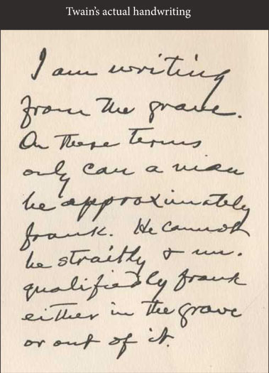
Greetings backers, below is the poll for which font you find to be most readable, and a sample of Twain’s handwriting, so you can see that matching it might not be the best policy for readability reasons. Please take a moment to look, and then choose the one that you find to be the most aesthetically pleasing/readable.
Thank you for your participation!


#6
Your opinion has been recorded!
Any reason that one stands out for you above the rest?
#6. It’s not the most similar, but it’s the most legible. Which is key with a graphic novel 🙂